8 Linear regression models
8.1 Introduction
This chapter continues the theme of analysing statistical associations between variables. The methods described here are appropriate when the response variable \(Y\) is a continuous, interval level variable. We will begin by considering bivariate situations where the only explanatory variable \(X\) is also a continuous variable. Section 8.2 first discusses graphical and numerical descriptive techniques for this case, focusing on two very commonly used tools: a scatterplot of two variables, and a measure of association known as the correlation coefficient. Section 8.3 then describes methods of statistical inference for associations between two continuous variables. This is done in the context of a statistical model known as the simple linear regression model.
The ideas of simple linear regression modelling can be extended to a much more general and powerful set methods known as multiple linear regression models. These can have several explanatory variables, which makes it possible to examine associations between any explanatory variable and the response variable, while controlling for other explanatory variables. An important reason for the usefulness of these models is that they play a key role in statistical analyses which correspond to research questions that are causal in nature. As an interlude, we discuss issues of causality in research design and analysis briefly in Section 8.4. Multiple linear models are then introduced in Section 8.5. The models can also include categorical explanatory variables with any number of categories, as explained in Section 8.6.
The following example will be used for illustration throughout this chapter:
Example 8.1: Indicators of Global Civil Society
The Global Civil Society 2004/5 yearbook gives tables of a range of characteristics of the countries of the world.39 The following measures will be considered in this chapter:
Gross Domestic Product (GDP) per capita in 2001 (in current international dollars, adjusted for purchasing power parity)
Income level of the country in three groups used by the Yearbook, as Low income, Middle income or High income
Income inequality measured by the Gini index (with 0 representing perfect equality and 100 perfect inequality)
A measure of political rights and civil liberties in 2004, obtained as the average of two indices for these characteristics produced by the Freedom House organisation (1 to 7, with higher values indicating more rights and liberties)
World Bank Institute’s measure of control of corruption for 2002 (with high values indicating low levels of corruption)
Net primary school enrolment ratio 2000-01 (%)
Infant mortality rate 2001 (% of live births)
We will discuss various associations between these variables. It should be noted that the analyses are mainly illustrative examples, and the choices of explanatory and response variables do not imply any strong claims about causal connections between them. Also, the fact that different measures refer to slightly different years is ignored; in effect, we treat each variable as a measure of “recent” situation in the countries. The full data set used here includes 165 countries. Many of the variables are not available for all of them, so most of the analyses below use a smaller number of countries.
8.2 Describing association between two continuous variables
8.2.1 Introduction
Suppose for now that we are considering data on two continuous variables. The descriptive techniques discussed in this section do not strictly speaking require a distinction between an explanatory variable and a response variable, but it is nevertheless useful in many if not most applications. We will reflect this in the notation by denoting the variables \(X\) (for the explanatory variable) and \(Y\) (for the response variable). The observed data consist of the pairs of observations \((X_{1}, Y_{1}), (X_{2}, Y_{2}), \dots, (X_{n}, Y_{n})\) of \(X\) and \(Y\) for each of the \(n\) subjects in a sample, or, with more concise notation, \((X_{i}, Y_{i})\) for \(i=1,2,\dots,n\).
We are interested in analysing the association between \(X\) and \(Y\). Methods for describing this association in the sample are first described in this section, initially with some standard graphical methods in Section 8.2.2. This leads to a discussion in Section 8.2.3 of what we actually mean by associations in this context, and then to a definion of numerical summary measures for such associations in Section 8.2.4. Statistical inference for the associations will be considered in Section 8.3.
8.2.2 Graphical methods
Scatterplots
The standard statistical graphic for summarising the association between two continuous variables is a scatterplot. An example of it is given in Figure 8.1, which shows a scatterplot of Control of corruption against GDP per capita for 61 countries for which the corruption variable is at least 60 (the motivation of this restriction will be discussed later). The two axes of the plot show possible values of the two variables. The horizontal axis, here corresponding to Control of corruption, is conventionally used for the explanatory variable \(X\), and is often referred to as the X-axis. The vertical axis, here used for GDP per capita, then corresponds to the response variable \(Y\), and is known as the Y-axis.

The observed data are shown as points in the scatterplot, one for each of the \(n\) units. The location of each point is determined by its values of \(X\) and \(Y\). For example, Figure 8.1 highlights the observation for the United Kingdom, for which the corruption measure (\(X\)) is 94.3 and GDP per capita (\(Y\)) is $24160. The point for UK is thus placed at the intersection of a vertical line drawn from 94.3 on the \(X\)-axis and a horizontal line from 24160 on the \(Y\)-axis, as shown in the plot.
The principles of good graphical presentation on clear labelling, avoidance of spurious decoration and so on (c.f. Section 2.8) are the same for scatterplots as for any statistical graphics. Because the crucial visual information in a scatterplot is the shape of the cloud of the points, it is now often not necessary for the scales of the axes to begin at zero, especially if this is well outside the ranges of the observed values of the variables (as it is for the \(X\)-axis of Figure 8.1). Instead, the scales are typically selected so that the points cover most of the plotting surface. This is done by statistical software, but there are many situations were it is advisable to overrule the automatic selection (e.g. for making scatterplots of the same variables in two different samples directly comparable).
The main purpose of a scatterplot is to examine possible associations between \(X\) and \(Y\). Loosely speaking, this means considering the shape and orientation of the cloud of points in the graph. In Figure 8.1, for example, it seems that most of the points are in a cluster sloping from lower left to upper right. This indicates that countries with low levels of Control of corruption (i.e. high levels of corruption itself) tend to have low GDP per capita, and those with little corruption tend to have high levels of GDP. A more careful discussion of such associations again relates them to the formal definition in terms of conditional distributions, and also provides a basis for the methods of inference introduced later in this chapter. We will resume the discussion of these issues in Section 8.2.3 below. Before that, however, we will digress briefly from the main thrust of this chapter in order to describe a slightly different kind of scatterplot.
Line plots for time series
A very common special case of a scatterplot is one where the observations correspond to measurements of a variable for the same unit at several occasions over time. This is illustrated by the following example (another one is Figure 2.9):
Example: Changes in temperature, 1903–2004
Figure 8.2 summarises data on average annual temperatures over the past century in five locations. The data were obtained from the GISS Surface Temperature (GISTEMP) database maintained by the NASA Goddard Institute for Space Studies.40 The database contains time series of average monthly surface temperatures from several hundred meterological stations across the world. The five sites considered here are Haparanda in Northern Sweden, Independence, Kansas in the USA, Choshi on the east coast of Japan, Kimberley in South Africa, and the Base Orcadas Station on Laurie Island, off the coast of Antarctica. These were chosen rather haphazardly for this illustration, with the aim of obtaining a geographically scattered set of rural or small urban locations (to avoid issues with the heating effects of large urban areas). The temperature for each year at each location is here recorded as the difference from the temperature at that location in 1903.41
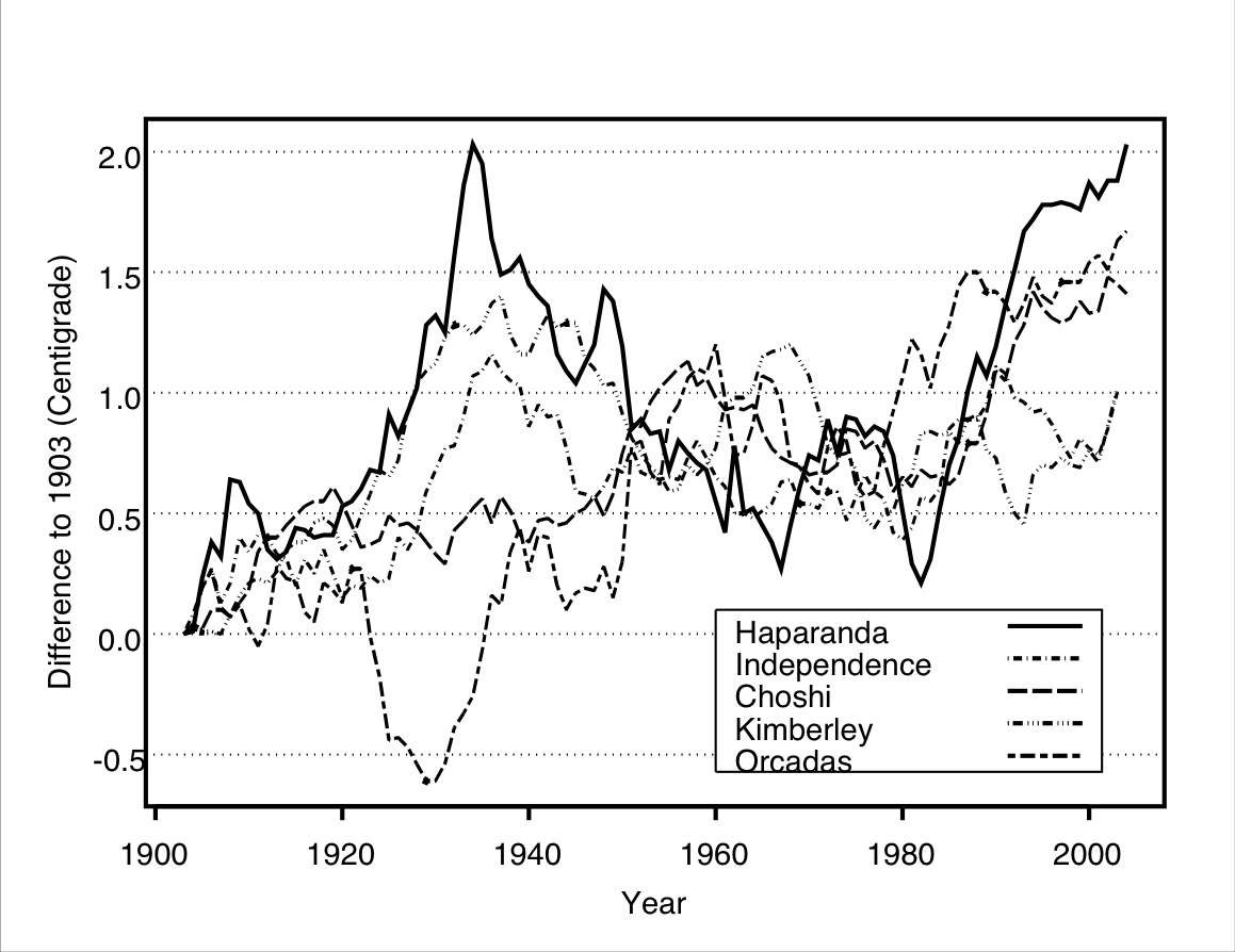
Consider first the data for Haparanda only. Here we have two variables, year and temperature, and 102 pairs of observations of them, one for each year between 1903 and 2004. These pairs could now be plotted in a scatterplot as described above. Here, however, we can go further to enhance the visual effect of the plot. This is because the observations represent measurements of a variable (temperature difference) for the same unit (the town of Haparanda) at several successive times (years). These 102 measurements form a time series of temperature differences for Haparanda over 1903–2004. A standard graphical trick for such series is to connect the points for successive times by lines, making it easy for the eye to follow the changes over time in the variable on the \(Y\)-axis. In Figure 8.2 this is done for Haparanda using a solid line. Note that doing this would make no sense for scatter plots like the one in Figure 8.1, because all the points there represent different subjects, in that case countries.
We can easily include several such series in the same graph. In Figure 8.2 this is done by plotting the temperature differences for each of the five locations using different line styles. The graph now summarises data on three variables, year, temperature and location. We can then examine changes over time for any one location, but also compare patterns of changes between them. Here there is clearly much variation within and between locations, but also some common features. Most importantly, the temperatures have all increased over the past century. In all five locations the average annual temperatures at the end of the period were around 1–2\(^{\circ}\)C higher than in 1903.
A set of time series like this is an example of dependent data in the sense discussed in Section 7.5. There we considered cases with pairs of observations, where the two observations in each pair had to be treated as statistically dependent. Here all of the temperature measurements for one location are dependent, probably with strongest dependence between adjacent years and less dependence between ones further apart. This means that we will not be able to analyse these data with the methods described later in this chapter, because these assume statistically independent observations. Methods of statistical modelling and inference for dependent data of the kind illustrated by the temperature example are beyond the scope of this course. This, however, does not prevent us from using a plot like Figure 8.2 to describe such data.
8.2.3 Linear associations
Consider again statistically independent observations of \((X_{i}, Y_{i})\), such as those displayed in Figure 8.1. Recall the definition that two variables are associated if the conditional distribution of \(Y\) given \(X\) is different for different values of \(X\). In the two-sample examples of Chapter 7 this could be examined by comparing two conditional distributions, since \(X\) had only two possible values. Now, however, \(X\) has many (in principle, infinitely many) possible values, so we will need to somehow define and compare conditional distributions given each of them. We will begin with a rather informal discussion of how this might be done. This will lead directly to a more precise and formal definition introduced in Section 8.3.

Figure 8.3 shows the same scatterplot as Figure 8.1. Consider first one value of \(X\) (Control of corruption), say 65. To get a rough idea of the conditional distribution of \(Y\) (GDP per capita) given this value of \(X\), we could examine the sample distribution of the values of \(Y\) for the units for which the value of \(X\) is close to 65. These correspond to the points near the vertical line drawn at \(X=65\) in Figure 8.3. This can be repeated for any value of \(X\); for example, Figure 8.3 also includes a vertical reference line at \(X=95\), for examining the conditional distribution of \(Y\) given \(X=95\).42
As in Chapter 7, associations between variables will here be considered almost solely in terms of differences in the means of the conditional distributions of \(Y\) at different values of \(X\). For example, Figure 8.3 suggests that the conditional mean of \(Y\) when X is 65 is around or just under 10000. At \(X=95\), on the other hand, the conditional mean seems to be between 20000 and 25000. The mean of \(Y\) is thus higher at the larger value of X. More generally, this finding is consistent across the scatterplot, in that the conditional mean of \(Y\) appears to increase when we consider increasingly large values of \(X\), indicating that higher levels of Control of corruption are associated with higher average levels of GDP. This is often expressed by saying that the conditional mean of \(Y\) increases when we “increase” \(X\).43 This is the sense in which we will examine associations between continuous variables: does the conditional mean of \(Y\) change (increase or decrease) when we increase \(X\)? If it does, the two variables are associated; if it does not, there is no association of this kind. This definition also agrees with the one linking association with prediction: if the mean of \(Y\) is different for different values of \(X\), knowing the value of \(X\) will clearly help us in making predictions about likely values of \(Y\). Based on the information in Figure 8.3, for example, our best guesses of the GDPs of two countries would clearly be different if we were told that the control of corruption measure was 65 for one country and 95 for the other.
The nature of the association between \(X\) and \(Y\) is characterised by how the values of \(Y\) change when \(X\) increases. First, it is almost always reasonable to conceive these changes as reasonably smooth and gradual. In other words, if two values of \(X\) are close to each other, the conditional means of \(Y\) will be similar too; for example, if the mean of \(Y\) is 5 when \(X=10\), its mean when \(X=10.01\) is likely to be quite close to 5 rather than, say, 405. In technical terms, this means that the conditional mean of \(Y\) will be described by a smooth mathematical function of \(X\). Graphically, the means of \(Y\) as \(X\) increases will then trace a smooth curve in the scatterplot. The simplest possibility for such a curve is a straight line. This possibility is illustrated by plot (a) of Figure 8.4 (this and the other five plots in the figure display artificial data, generated for this illustration). Here all of the points fall on a line, so that when \(X\) increases, the values of \(Y\) increase at a constant rate. A relationship like this is known as a linear association between \(X\) and \(Y\). Linear associations are the starting point for examining associations between continuous variables, and often the only ones considered. In this chapter we too will focus almost completely on them.
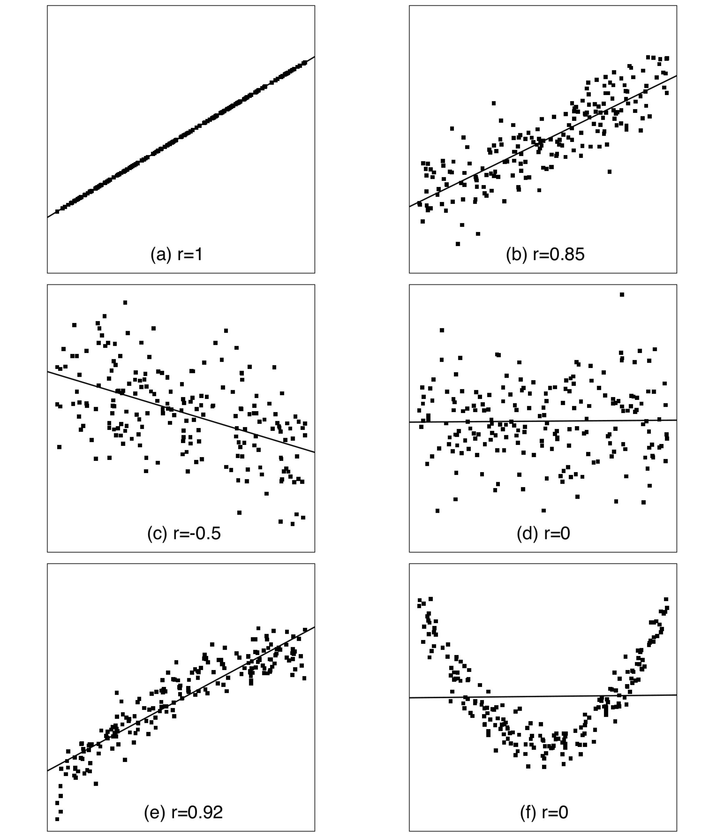
In plot (a) of Figure 8.4 all the points are exactly on the straight line. This indicates a perfect linear association, where \(Y\) can be predicted exactly if \(X\) is known, so that the association is deterministic. Such a situation is neither realistic in practice, nor necessary for the association to be described as linear. All that is required for the latter is that the conditional means of \(Y\) given different values of \(X\) fall (approximately) on a straight line. This is illustrated by plot (b) of Figure 8.4, which shows a scatterplot of individual observations together with an approximation of the line of the means of \(Y\) given \(X\) (how the line was drawn will be explained later). Here the linear association is not perfect, as the individual points are not all on the same line but scattered around it. Nevertheless, the line seems to capture an important systematic feature of the data, which is that the average values of \(Y\) increase at an approximately constant rate as \(X\) increases. This combination of systematic and random elements is characteristic of all statistical associations, and it is also central to the formal setting for statistical inference for linear associations described in Section 8.3 below.
The direction of a linear association can be either positive or negative. Plots (a) and (b) of Figure 8.4 show a positive association, because increasing \(X\) is associated with increasing average values of \(Y\). This is indicated by the upward slope of the line describing the association. Plot (c) shows an example of a negative association, where the line slopes downwards and increasing values of \(X\) are associated with decreasing values of \(Y\). The third possibility, illustrated by plot (d), is that the line slopes neither up nor down, so that the mean of \(Y\) is the same for all values of \(X\). In this case there is no (linear) association between the variables.
Not all associations between continuous variables are linear, as shown by the remaining two plots of Figure 8.4. These illustrate two kinds of nonlinear associations. In plot (e), the association is still clearly monotonic, meaning that average values of \(Y\) change in the same direction — here increase — when \(X\) increases. The rate of this increase, however, is not constant, as indicated by the slightly curved shape of the cloud of points. The values of \(Y\) seem to increase faster for small values of \(X\) than for large ones. A straight line drawn through the scatterplot captures the general direction of the increase, but misses its nonlinearity. One practical example of such a relationship is the one between years of job experience and salary: it is often found that salary increases fastest early on in a person’s career and more slowly later on.
Plot (f) shows a nonlinear and nonmonotonic relationship: as \(X\) increases, average values of \(Y\) first decrease to a minimum, and then increase again, resulting in a U-shaped scatterplot. A straight line is clearly an entirely inadequate description of such a relationship. A nonmonotonic association of this kind might be seen, for example, when considering the dependence of the failure rates of some electrical components (\(Y\)) on their age (\(X\)). It might then be that the failure rates were high early (from quick failures of flawed components) and late on (from inevitable wear and tear) and lowest in between for “middle-aged but healthy” components.

Returning to real data, recall that we have so far considered control of corruption and GDP per capita only among countries with a Control of corruption score of at least 60. The scatterplot for these, shown in Figure 8.3, also includes a best-fitting straight line. The observed relationship is clearly positive, and seems to be fairly well described by a straight line. For countries with relatively low levels of corruption, the association between control of corruption and GDP can be reasonably well characterised as linear.
Consider now the set of all countries, including also those with high levels of corruption (scores of less than 60). In a scatterplot for them, shown in Figure 8.5, the points with at least 60 on the \(X\)-axis are the same as those in Figure 8.3, and the new points are to the left of them. The plot now shows a nonlinear relationship comparable to the one in plot (e) of Figure 8.4. The linear relationship which was a good description for the countries considered above is thus not adequate for the full set of countries. Instead, it seems that the association is much weaker for the countries with high levels of corruption, essentially all of which have fairly low values of GDP per capita. The straight line fitted to the plot identifies the overall positive association, but cannot describe its nonlinearity. This example further illustrates how scatterplots can be used to examine relationships between variables and to assess whether they can be best described as linear or nonlinear associations.44
So far we have said nothing about how the exact location and direction of the straight lines shown in the figures have been selected. These are determined so that the fitted line is in a certain sense the best possible one for describing the data in the scatterplot. Because the calculations needed for this are also (and more importantly) used in the context of statistical inference for such data, we will postpone a description of them until Section 8.3.4. For now we can treat the line simply as a visual summary of the linear association in a scatterplot.
8.2.4 Measures of association: covariance and correlation
A scatterplot is a very powerful tool for examining sample associations of pairs of variables in detail. Sometimes, however, this is more than we really need for an initial summary of a data set, especially if there are many variables and thus many possible pairs of them. It is then convenient also to be able to summarise each pairwise association using a single-number measure of association. This section introduces the correlation coefficient, the most common such measure for continuous variables. It is a measure of the strength of linear associations of the kind defined above.
Suppose that we consider two variables, denoted \(X\) and \(Y\). This again implies a distinction between an explanatory and a response variable, to maintain continuity of notation between different parts of this chapter. The correlation coefficient itself, however, is completely symmetric, so that its value for a pair of variables will be the same whether or not we treat one or the other of them as explanatory for the other. First, recall from equation of standard deviation towards the end of Section 2.6.2 that the sample standard deviations of the two variables are calculated as \[\begin{equation} s_{x} = \sqrt{\frac{\sum(X_{i}-\bar{X})^{2}}{n-1}} \text{and} s_{y} = \sqrt{\frac{\sum (Y_{i}-\bar{Y})^{2}}{n-1}} \tag{8.1} \end{equation}\] where the subscripts \(x\) and \(y\) identify the two variables, and \(\bar{X}\) and \(\bar{Y}\) are their sample means. A new statistic is the sample covariance between \(X\) and \(Y\), defined as \[\begin{equation} s_{xy} = \frac{\sum (X_{i}-\bar{X})(Y_{i}-\bar{Y})}{n-1}. \tag{8.2} \end{equation}\] This is a measure of linear association between \(X\) and \(Y\). It is positive if the sample association is positive and negative if the association is negative.
In theoretical statistics, covariance is the fundamental summary of sample and population associations between two continuous variables. For descriptive purposes, however, it has the inconvenient feature that its magnitude depends on the units in which \(X\) and \(Y\) are measured. This makes it difficult to judge whether a value of the covariance for particular variables should be regarded as large or small. To remove this complication, we can standardise the sample covariance by dividing it by the standard deviations, to obtain the statistic \[\begin{equation} r=\frac{s_{xy}}{s_{x}s_{y}} = \frac{\sum (X_{i}-\bar{X})(Y_{i}-\bar{Y})}{\sqrt{\sum\left(X_{i}-\bar{X}\right)^{2} \sum\left(Y_{i}-\bar{Y}\right)^{2}}}. \tag{8.3} \end{equation}\] This is the (sample) correlation coefficient, or correlation for short, between \(X\) and \(Y\). It is also often (e.g. in SPSS) known as Pearson’s correlation coefficient after Karl Pearson (of the \(\chi^{2}\) test, see first footnote in Chapter 4), although both the word and the statistic are really due to Sir Francis Galton.45
The properties of the correlation coefficient can be described by going through the same list as for the \(\gamma\) coefficient in Section 2.4.5. While doing so, it is useful to refer to the examples in Figure 8.4, where the correlations are also shown.
Sign: Correlation is positive if the linear association between the variables is positive, i.e. if the best-fitting straight line slopes upwards (as in plots a, b and e) and negative if the association is negative (c). A zero correlation indicates complete lack of linear association (d and f).
Extreme values: The largest possible correlation is \(+1\) (plot a) and the smallest \(-1\), indicating perfect positive and negative linear associations respectively. More generally, the magnitude of the correlation indicates the strength of the association, so that the closer to \(+1\) or \(-1\) the correlation is, the stronger the association (e.g. compare plots a–d). It should again be noted that the correlation captures only the linear aspect of the association, as illustrated by the two nonlinear cases in Figure 8.4. In plot (e), there is curvature but also a strong positive trend, and the latter is reflected in a fairly high correlation. In plot (f), the trend is absent and the correlation is 0, even though there is an obvious nonlinear relationship. Thus the correlation coefficient is a reasonable initial summary of the strength of association in (e), but completely misleading in (f).
Formal interpretation: The correlation coefficient cannot be interpreted as a Proportional Reduction in Error (PRE) measure, but its square can. The latter statistic, so-called coefficient of determination or \(R^{2}\), is described in Section 8.3.3.
Substantive interpretation: As with any measure of association, the question of whether a particular sample correlation is high or low is not a purely statistical question, but depends on the nature of the variables. This can be judged properly only with the help of experience of correlations between similar variables in different contexts. As one very rough rule thumb it might be said that in many social science contexts correlations greater than 0.4 (or smaller than \(-0.4\)) would typically be considered noteworthy and ones greater than 0.7 quite strong.
Returning to real data, Table 8.1 shows the correlation coefficients for all fifteen distinct pairs of the six continuous variables in the Global Civil Society data set mentioned in Example 8.1. This is an example of a correlation matrix, which is simply a table with the variables as both its rows and columns, and the correlation between each pair of variables given at the intersection of corresponding row and column. For example, the correlation of GDP per capita and School enrolment is here 0.42. This is shown at the intersection of the first row (GDP) and fifth column (School enrolment), and also of the fifth row and first column. In general, every correlation is shown twice in the matrix, once in its upper triangle and once in the lower. The triangles are separated by a list of ones on the diagonal of the matrix. This simply indicates that the correlation of any variable with itself is 1, which is true by definition and thus of no real interest.
| Variable | GDP | Gini | Pol. | Corrupt. | School | IMR |
|---|---|---|---|---|---|---|
| GDP per capita [GDP ] | 1 | -0.39 | 0.51 | 0.77 | 0.42 | -0.62 |
| Income inequality [Gini ] | -0.39 | 1 | -0.15 | -0.27 | -0.27 | 0.42 |
| Political rights [Pol. ] | 0.51 | -0.15 | 1 | 0.59 | 0.40 | -0.44 |
| Control of corruption [Corrupt. ] | 0.77 | -0.27 | 0.59 | 1 | 0.41 | -0.64 |
| School enrolment [School ] | 0.42 | -0.27 | 0.40 | 0.41 | 1 | -0.73 |
| Infant mortality [IMR ] | -0.62 | 0.42 | -0.44 | -0.64 | -0.73 | 1 |
All of the observed associations in this example are in unsurprising directions. For example, School enrolment is positively correlated with GDP, Political rights and Control of corruption, and negatively correlated with Income inequality and Infant mortality. In other words, countries with large percentages of children enrolled in primary school tend to have high levels of GDP per capita and of political rights and civil liberties, and low levels of corruption, income inequality and infant mortality. The strongest associations in these data are between GDP per capita and Control of corruption (\(r=0.77\)) and School enrolment and Infant mortality rate (\(r=-0.73\)), and the weakest between Income inequality on the one hand and Political rights, Control of corruption and School enrolment on the other (correlations of \(-0.15\), \(-0.27\) and \(-0.27\) respectively).
These correlations describe only the linear element of sample associations, but give no hint of any nonlinear ones. For example, the correlation of 0.77 between GDP and Control of corruption summarises the way the observations cluster around the straight line shown in Figure 8.5. The correlation is high because this increase in GDP as Control of corruption increases is quite strong, but it gives no indication of the nonlinearity of the association. A scatterplot is needed for revealing this feature of the data. The correlation for the restricted set of countries shown in Figure 8.3 is 0.82.
A correlation coefficient can also be defined for the joint population distribution of two variables. The sample correlation \(r\) can then be treated as an estimate of the population correlation, which is often denoted by \(\rho\) (the lower-case Greek “rho”). Statistical inference for the population correlation can also be derived. For example, SPSS automatically outputs significance tests for the null hypothesis that \(\rho\) is 0, i.e. that there is no linear association between \(X\) and \(Y\) in the population. Here, however, we will not discuss this, choosing to treat \(r\) purely as a descriptive sample statistic. The next section provides a different set of tools for inference on population associations.
8.3 Simple linear regression models
8.3.1 Introduction
The rest of this course is devoted to the method of linear regression modelling. Its purpose is the analysis of associations in cases where the response variable is a continuous, interval level variable, and the possibly several explanatory variables can be of any type. We begin in this section with simple linear regression, where there is only one explanatory variable. We will further assume that this is also continuous. The situation considered here is thus the same as in the previous section, but here the focus will be on statistical inference rather than description. Most of the main concepts of linear regression can be introduced in this context. Those that go beyond it are described in subsequent sections. Section 8.5 introduces multiple regression involving more than one explanatory variable. The use of categorical explanatory variables in such models is explained in Section 8.6. Finally, Section 8.7 gives a brief review of some further aspects of linear regression modelling which are not covered on this course.
Example: Predictors of Infant Mortality Rate
The concepts of linear regression models will be illustrated as they are introduced with a second example from the Global Civil Society data set. The response variable will now be Infant Mortality Rate (IMR). This is an illuminating outcome variable, because it is a sensitive and unquestionably important reflection of a country’s wellbeing; whatever we mean by “development”, it is difficult to disagree that high levels of it should coincide with low levels of infant mortality. We will initially consider only one explanatory variable, Net primary school enrolment ratio, referred to as “School enrolment” for short. This is defined as the percentage of all children of primary school age who are enrolled in school. Enrolment numbers and the population size are often obtained from different official sources, which sometimes leads to discrepancies. In particular, School enrolment for several countries is recorded as over 100, which is logically impossible. This is an illustration of the kinds of measurement errors often affecting variables in the social sciences. We will use the School enrolment values as recorded, even though they are known to contain some error.
A scatterplot of IMR vs. School enrolment is shown in Figure 8.6, together with the best-fitting straight line. Later we will also consider three additional explanatory variables: Control of corruption, Income inequality and Income level of the country in three categories (c.f. Example 8.1). For further reference, Table 8.2 shows various summary statistics for these variables. Throughout, the analyses are restricted to those 111 countries for which all of the five variables are recorded. For this reason the correlations in Table 8.2 differ slightly from those in Table 8.1, where each correlation was calculated for all the countries with non-missing values of that pair of variables.

|
IMR |
School enrolment | Control of corruption | Income inequality | |
|---|---|---|---|---|
| Summary statistics | ||||
| Mean | 4.3 | 86.1 | 50.1 | 40.5 |
| std. deviation | 4.0 | 16.7 | 28.4 | 10.2 |
| Minimum | 0.3 | 30.0 | 3.6 | 24.4 |
| Maximum | 15.6 | 109.0 | 100.0 | 70.7 |
| Correlation matrix | ||||
| IMR | 1 | -0.75 | -0.60 | 0.39 |
| School enrolment | -0.75 | 1 | 0.39 | -0.27 |
| Control of corruption | -0.60 | 0.39 | 1 | -0.27 |
| Income inequality | 0.39 | -0.27 | -0.27 | 1 |
| Means for countries in different income categories | ||||
| Low income (\(n=41\)) | 8.2 | 72.1 | 27.5 | 41.7 |
| Middle income (\(n=48\)) | 2.8 | 92.5 | 50.8 | 43.3 |
| High income (\(n=22\)) | 0.5 | 98.4 | 90.7 | 32.0 |
8.3.2 Definition of the model
The simple linear regression model defined in this section is a statistical model for a continuous, interval level response variable \(Y\) given a single explanatory variable \(X\), such as IMR given School enrolment. The model will be used to carry out statistical inference on the association between the variables in a population (which in the IMR example is clearly again of the conceptual variety).
For motivation, recall first the situation considered in Section 7.3. There the data consisted of observations \((Y_{i}, X_{i})\) for \(i=1,2,\dots,n\), which were assumed to be statistically independent. The response variable \(Y\) was continuous but \(X\) had only two possible values, coded 1 and 2. A model was then set up where the population distribution of \(Y\) had mean \(\mu_{1}\) and variance \(\sigma^{2}_{1}\) for units with \(X=1\), and mean \(\mu_{2}\) and variance \(\sigma^{2}_{2}\) when \(X=2\). In some cases it was further assumed that the population distributions were both normal, and that the population variances were equal, i.e. that \(\sigma^{2}_{1}=\sigma^{2}_{2}\), with their common value denoted \(\sigma^{2}\). With these further assumptions, which will also be used here, the model for \(Y\) given a dichotomous \(X\) stated that (1) observations for different units \(i\) were statistically independent; (2) each \(Y_{i}\) was sampled at random from a population distribution which was normal with mean \(\mu_{i}\) and variance \(\sigma^{2}\); and (3) \(\mu_{i}\) depended on \(X_{i}\) so that it was equal to \(\mu_{1}\) if \(X_{i}\) was 1 and \(\mu_{2}\) if \(X_{i}\) was 2.
The situation in this section is exactly the same, except that \(X\) is now continuous instead of dichotomous. We will use the same basic model, but will change the specification of the conditional mean \(\mu_{i}\) appropriately. In the light of the discussion in previous sections of this chapter, it is no surprise that this will be defined in such a way that it describes a linear association between \(X\) and \(Y\). This is done by setting \(\mu_{i}=\alpha+\beta X_{i}\), where \(\alpha\) and \(\beta\) are unknown population parameters. This is the equation of straight line (we will return to it in the next section). With this specification, the model for observations \((Y_{1},X_{1}), (Y_{2}, X_{2}), \dots, (Y_{n}, X_{n})\) becomes
Observations for different units \(i\) (\(=1,2,\dots,n\)) are statistically independent.
Each \(Y_{i}\) is normally distributed with mean \(\mu_{i}\) and variance \(\sigma^{2}\).
The means \(\mu_{i}\) depend on \(X_{i}\) through \(\mu_{i}=\alpha+\beta X_{i}\).
Often the model is expressed in an equivalent form where 2. and 3. are combined as \[\begin{equation} Y_{i}=\alpha+\beta X_{i} +\epsilon_{i} \tag{8.4} \end{equation}\] where each \(\epsilon_{i}\) is normally distributed with mean 0 and variance \(\sigma^{2}\). The \(\epsilon_{i}\) are known as error terms or population residuals (and the letter \(\epsilon\) is the lower-case Greek “epsilon”). This formulation of the model clearly separates the mean of \(Y_{i}\), which traces the straight line \(\alpha+\beta X_{i}\) as \(X_{i}\) changes, from the variation around that line, which is described by the variability of \(\epsilon_{i}\).
The model defined above is known as the simple linear regression model:
Simple because it has only one explanatory variable, as opposed to multiple linear regression models which will have more than one.
Linear because it specifies a linear association between \(X\) and \(Y\).46
Regression: This is now an established part of the name of the model, although the origins of the word are not central to the use of the model.47
-
Model, because this is a statistical model in the sense discussed in the middle of Section 6.3.1. In other words, the model is always only a simplified abstraction of the true, immeasurably complex processes which determine the values of \(Y\). Nevertheless, it is believed that a well-chosen model can be useful for explaining and predicting observed values of \(Y\). This spirit is captured by the well-known statement by the statistician George Box:48
All models are wrong, but some are useful.
A model like this has the advantage that it reduces the examination of associations in the population to estimation and inference on a small number of model parameters, in the case of the simple linear regression model just \(\alpha\), \(\beta\) and \(\sigma^{2}\).
Of course, not all models are equally appropriate for given data, and some will be both wrong and useless. The results from a model should thus be seriously presented and interpreted only if the model is deemed to be reasonably adequate. For the simple linear regression model, this can be partly done by examining whether the scatterplot between \(X\) and \(Y\) appears to be reasonably consistent with a linear relationship. Some further comments on the assessment of model adequacy will be given in Section 8.7.
8.3.3 Interpretation of the model parameters
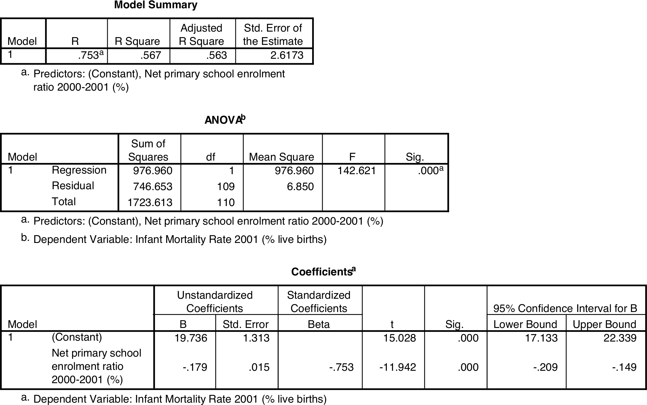
The simple linear regression model ((8.4)) has three parameters, \(\alpha\), \(\beta\) and \(\sigma^{2}\). Each of these has its own interpretation, which are explained in this section. Sometimes it will be useful to illustrate the definition with specific numerical values, for which we will use ones for the model for IMR given School enrolment in our example. SPSS output for this model is shown in Figure 8.7. Note that although these values are first used here to illustrate the interpretation of the population parameters in the model, they are of course only estimates (of a kind explained in the next section) of those parameters. Other parts of the SPSS output will be explained later in this chapter.
According to the model, the conditional mean (also often known as the conditional expected value) of \(Y\) given \(X\) in the population is (dropping the subscript \(i\) for now for notational simplicity) \(\mu=\alpha+\beta X\). The two parameters \(\alpha\) and \(\beta\) in this formula are known as regression coefficients. They are interpreted as follows:
\(\alpha\) is the expected value of \(Y\) when \(X\) is equal to 0. It is known as the intercept or constant term of the model.
\(\beta\) is the change in the expected value of \(Y\) when \(X\) increases by 1 unit. It is known as the slope term or the coefficient of \(X\).
Just to include one mathematical proof in this coursepack, these results can be derived as follows:
When \(X=0\), the mean of \(Y\) is \(\mu=\alpha+\beta X=\alpha+\beta\times 0 =\alpha+0=\alpha\).
-
Compare two observations, one with value \(X\) of the explanatory variable, and the other with one unit more, i.e. \(X+1\). The corresponding means of \(Y\) are
with \(X+1\): \(\mu\) \(=\alpha+\beta\times (X+1)\) \(=\alpha+\beta X +\beta\) with \(X\): \(\mu\) \(=\alpha+\beta X\) Difference: \(\beta\)
which completes the proof of the claims above — Q.E.D. In case you prefer a graphical summary, this is given in Figure 8.8.

The most important parameter of the model, and usually the only one really discussed in interpreting the results, is \(\beta\), the regression coefficient of \(X\). It is also called the slope because it is literally the slope of the regression line, as shown in Figure 8.8. It is the only parameter in the model which describes the association between \(X\) and \(Y\), and it does so in the above terms of expected changes in \(Y\) corresponding to changes in X (\(\beta\) is also related to the correlation between \(X\) and \(Y\), in a way explained in the next section). The sign of \(\beta\) indicates the direction of the association. When \(\beta\) is positive (greater than 0), the regression line slopes upwards and increasing \(X\) thus also increases the expected value of \(Y\) — in other words, the association between \(X\) and \(Y\) is positive. This is the case illustrated in Figure 8.8. If \(\beta\) is negative, the regression line slopes downwards and the association is also negative. Finally, if \(\beta\) is zero, the line is parallel with the \(X\)-axis, so that changing \(X\) does not change the expected value of \(Y\). Thus \(\beta=0\) corresponds to no (linear) association between \(X\) and \(Y\).
In the real example shown in Figure 8.7, \(X\) is School enrolment and \(Y\) is IMR. In SPSS output, the estimated regression coefficients are given in the “Coefficients” table in the column labelled “B” under “Unstandardized coefficients”. The estimated constant term \(\alpha\) is given in the row labelled “(Constant)”, and the slope term on the next row, labelled with the name or label of the explanatory variable as specified in the SPSS data file — here “Net primary school enrolment ratio 2000-2001 (%)”. The value of the intercept is here 19.736 and the slope coefficient is \(-0.179\). The estimated regression line for expected IMR is thus \(19.736-0.179 X\), where \(X\) denotes School enrolment. This is the line shown in Figure 8.6.
Because the slope coefficient in the example is negative, the association between the variables is also negative, i.e. higher levels of school enrolment are associated with lower levels of infant mortality. More specifically, every increase of one unit (here one percentage point) in School enrolment is associated with a decrease of 0.179 units (here percentage points) in expected IMR.
Since the meaning of \(\beta\) is related to a unit increase of the explanatory variable, the interpretation of its magnitude depends on what those units are. In many cases one unit of \(X\) is too small or too large for convenient interpretation. For example, a change of one percentage point in School enrolment is rather small, given that the range of this variable in our data is 79 percentage points (c.f. Table 8.2). In such cases the results can easily be reexpressed by using multiples of \(\beta\): specifically, the effect on expected value of \(Y\) of changing \(X\) by \(A\) units is obtained by multiplying \(\beta\) by \(A\). For instance, in our example the estimated effect of increasing School enrolment by 10 percentage points is to decrease expected IMR by \(10\times 0.179=1.79\) percentage points.
The constant term \(\alpha\) is a necessary part of the model, but it is almost never of interest in itself. This is because the expected value of \(Y\) at \(X=0\) is rarely specifically interesting. Very often \(X=0\) is also unrealistic, as in our example where it corresponds to a country with zero primary school enrolment. There are fortunately no such countries in the data, where the lowest School enrolment is 30%. It is then of no interest to discuss expected IMR for a hypothetical country where no children went to school. Doing so would also represent unwarranted extrapolation of the model beyond the range of the observed data. Even though the estimated linear model seems to fit reasonably well for these data, this is no guarantee that it would do so also for countries with much lower school enrolment, even if they existed.
The third parameter of the simple regression model is \(\sigma^{2}\). This is the variance of the conditional distribution of \(Y\) given \(X\). It is also known as the conditional variance of \(Y\), the error variance or the residual variance. Similarly, its square root \(\sigma\) is known as the conditional, error or residual standard deviation. To understand \(\sigma\), let us consider a single value of \(X\), such as one corresponding to one of the vertical dashed lines in Figure 8.8 or, say, school enrolment of 85 in Figure 8.6. The model specifies a distribution for \(Y\) given any such value of \(X\). If we were to (hypothetically) collect a large number of observations, all with this same value of \(X\), the distribution of \(Y\) for them would describe the conditional distribution of \(Y\) given that value of \(X\). The model states that the average of these values, i.e. the conditional mean of \(Y\), is \(\alpha+\beta X\), which is the point on the regression line corresponding to \(X\). The individual values of \(Y\), however, would of course not all be on the line but somewhere around it, some above and some below.
The linear regression model further specifies that the form of the conditional distribution of \(Y\) is approximately normal. You can try to visualise this by imagining a normal probability curve (c.f. Figure 6.5) on the vertical line from \(X\), centered on the regression line and sticking up from the page. The bell shape of the curve indicates that most of the values of \(Y\) for a given \(X\) will be close to the regression line, and only small proportions of them far from it. The residual standard deviation \(\sigma\) is the standard deviation of this conditional normal distribution, in essence describing how tightly concentrated values of \(Y\) tend to be around the regression line. The model assumes, mainly for simplicity, that the same value of \(\sigma\) applies to the conditional distributions at all values of \(X\); this is known as the assumption of homoscedasticity.
In SPSS output, an estimate of \(\sigma\) is given in the “Model Summary” table under the misleading label “Std. Error of the Estimate”. An estimate of the residual variance \(\sigma^{2}\) is found also in the “ANOVA” table under “Mean Square” for “Residual”. In our example the estimate of \(\sigma\) is 2.6173 (and that of \(\sigma^{2}\) is 6.85). This is usually not of direct interest for interpretation, but it will be a necessary component of some parts of the analysis discussed below.
8.3.4 Estimation of the parameters
Since the regression coefficients \(\alpha\) and \(\beta\) and the residual standard deviation \(\sigma\) are unknown population parameters, we will need to use the observed data to obtain sensible estimates for them. How to do so is now less obvious than in the cases of simple means and proportions considered before. This section explains the standard method of estimation for the parameters of linear regression models.
We will denote estimates of \(\alpha\) and \(\beta\) by \(\hat{\alpha}\) and \(\hat{\beta}\) (“alpha-hat” and “beta-hat”) respectively (other notations are also often used, e.g. \(a\) and \(b\)). Similarly, we can define \[\hat{Y}=\hat{\alpha}+\hat{\beta} X\] for \(Y\) given any value of \(X\). These are the values on the estimated regression line. They are known as fitted values for \(Y\), and estimating the parameters of the regression model is often referred to as “fitting the model” to the observed data. The fitted values represent our predictions of expected values of \(Y\) given \(X\), so they are also known as predicted values of \(Y\).
In particular, fitted values \(\hat{Y}_{i}=\hat{\alpha}+\hat{\beta}X_{i}\) can be calculated at the values \(X_{i}\) of the explanatory variable \(X\) for each unit \(i\) in the observed sample. These can then be compared to the correponding values \(Y_{i}\) of the response variable. Their differences \(Y_{i}-\hat{Y}_{i}\) are known as the (sample) residuals. These quantities are illustrated in Figure 8.9. This shows a fitted regression line, which is in fact the one for IMR given School enrolment also shown in Figure 8.6. Also shown are two points \((X_{i}, Y_{i})\). These are also from Figure 8.6; the rest have been omitted to simplify the plot. The point further to the left is the one for Mali, which has School enrolment \(X_{i}=43.0\) and IMR \(Y_{i}=14.1\). Using the estimated coefficients \(\hat{\alpha}=19.736\) and \(\hat{\beta}=-0.179\) in Figure 8.7, the fitted value for Mali is \(\hat{Y}_{i}=19.736-0.179\times 43.0=12.0\). Their difference is the residual \(Y_{i}-\hat{Y}_{i}=14.1-12.0=2.1\). Because the observed value is here larger than the fitted value, the residual is positive and the observed value is above the fitted line, as shown in Figure 8.9.

The second point shown in Figure 8.9 corresponds to the observation for Ghana, for which \(X_{i}=58.0\) and \(Y_{i}=5.7\). The fitted value is then \(\hat{Y}_{i}=19.736-0.179\times 58.0=9.4\) and the residual \(Y_{i}-\hat{Y}_{i}=5.7-9.4=-3.7\). Because the observed value is now smaller than the fitted value, the residual is negative and the observed \(Y_{i}\) is below the fitted regression line.
So far we have still not explained how the specific values of the parameter estimates in Figure 8.7 were obtained. In doing so, we are faced with the task of identifying a regression line which provides the best fit to the observed points in a scatterplot like Figure 8.6. Each possible choice of \(\hat{\alpha}\) and \(\hat{\beta}\) corresponds to a different regression line, and some choices are clearly better than others. For example, it seems intuitively obvious that it would be better for the line to go through the cloud of points rather than stay completely outside it. To make such considerations explicit, the residuals can be used as a criterion of model fit. The aim will then be to make the total magnitude of the residuals as small as possible, so that the fitted line is as close as possible to the observed points \(Y_{i}\) in some overall sense. This cannot be done simply by adding up the residuals, because they can have different signs, and positive and negative residuals could thus cancel out each other in the addition. As often before, the way around this is to remove the signs by considering the squares of the residuals. Summing these over all units \(i\) in the sample leads to the sum of squared residuals \[SSE = \sum (Y_{i}-\hat{Y}_{i})^{2}.\] Here \(SSE\) is short for Sum of Squares of Errors (it is also often called the Residual Sum of Squares or \(RSS\)). This is the quantity used as the criterion in estimating regression coefficients for a linear model. Different candidate values for \(\hat{\alpha}\) and \(\hat{\beta}\) lead to different values of \(\hat{Y}_{i}\) and thus of \(SSE\). The final estimates are the ones which give the smallest value of \(SSE\). Their formulas are \[\begin{equation} \hat{\beta}=\frac{\sum (X_{i}-\bar{X})(Y_{i}-\bar{Y})}{\sum (X_{i}-\bar{X})^{2}}=\frac{s_{xy}}{s_{x}^{2}} \tag{8.5} \end{equation}\] and \[\begin{equation} \hat{\alpha}=\bar{Y}-\hat{\beta}\bar{X} \tag{8.6} \end{equation}\] where \(\bar{Y}\), \(\bar{X}\), \(s_{x}\) and \(s_{xy}\) are the usual sample means, standard deviations and covariances for \(Y\) and \(X\). These are known as the least squares estimates of the regression coefficients (or as Ordinary Least Squares or OLS estimates), and the reasoning used to obtain them is the method of least squares.49 Least squares estimates are almost always used for linear regression models, and they are the ones displayed by SPSS and other software. For our model for IMR given School enrolment, the estimates are the \(\hat{\alpha}=19.736\) and \(\hat{\beta}=-0.179\) shown in Figure 8.7.
The estimated coefficients can be used to calculate predicted values for \(Y\) at any values of \(X\), not just those included in the observed sample. For instance, in the infant mortality example the predicted IMR for a country with School enrolment of 80% would be \(\hat{Y}=19.736-0.179\times 80=5.4\). Such predictions should usually be limited to the range of values of \(X\) actually observed in the data, and extrapolation beyond these values should be avoided.
The most common estimate of the remaining parameter of the model, the residual standard deviation \(\sigma\), is \[\begin{equation} \hat{\sigma}=\sqrt{\frac{\sum \left ( Y_{i}-\hat{Y}_{i}\right ) ^{2}}{n- \left ( k+1 \right )}}=\sqrt{\frac{SSE}{n- \left ( k+1 \right )}} \tag{8.7} \end{equation}\] where \(k\) is here set equal to 1. This bears an obvious resemblance to the formula for the basic sample standard deviation, shown for \(Y_{i}\) in ((8.1)). One difference to that formula is that the denominator of ((8.7)) is shown as \(n-(k+1)\) rather than \(n-1\). Here \(k=1\) is the number of explanatory variables in the model, and \(k+1=2\) is the number of regression coefficients (\(\alpha\) and \(\beta\)) including the constant term \(\alpha\). The quantity \(n-(k+1)\), i.e. here \(n-2\), is the degrees of freedom (\(df\)) of the parameter estimates. We will need it again in the next section. It is here given in the general form involving the symbol \(k\), so that we can later refer to the same formula for models with more explanatory variables and thus \(k\) greater than 1. In SPSS output, the degrees of freedom are shown in the “ANOVA” table under “df” for “Residual”. In the infant mortality example \(n=111\), \(k=1\) and \(df=111-2=109\), as shown in Figure 8.7.
Finally, two connections between previous topics and the parameters \(\hat{\alpha}\), \(\hat{\beta}\) and \(\hat{\sigma}\) are worth highlighting:
The estimated slope \(\hat{\beta}\) from ((8.5)) is related to the sample correlation \(r\) from ((8.3)) by \(r=(s_{x}/s_{y})\,\hat{\beta}\). In both of these it is \(\hat{\beta}\) which carries information about the association between \(X\) and \(Y\). The ratio \(s_{x}/s_{y}\) serves only to standardise the correlation coefficient so that it is always between \(-1\) and \(+1\). The slope coefficient \(\hat{\beta}\) is not standardised, and the interpretation of its magnitude depends on the units of measurement of \(X\) and \(Y\) in the way defined in Section 8.3.3.
Suppose we simplify the simple linear regression model ((8.4)) further by setting \(\beta=0\), thus removing \(\beta X\) from the model. The new model states that all \(Y_{i}\) are normally distributed with the same mean \(\alpha\) and standard deviation \(\sigma\). Apart from the purely notational difference of using \(\alpha\) instead of \(\mu\), this is exactly the single-sample model considered in Section 7.4. Using the methods of this section to obtain estimates of the two parameters of this model also leads to exactly the same results as before. The least squares estimate of \(\alpha\) is then \(\hat{\alpha}=\bar{Y}\), obtained by setting \(\hat{\beta}=0\) in ((8.6)). Since there is no \(\hat{\beta}\) in this case, \(\hat{Y}_{i}=\bar{Y}\) for all observations, \(k=0\) and \(df=n-(k+1)=n-1\). Substituting these into ((8.7)) shows that \(\hat{\sigma}\) is then equal to the usual sample standard deviation \(s_{y}\) of \(Y_{i}\).
Coefficient of determination (\(R^{2}\))
The coefficient of determination, more commonly known as \(\mathbf{R^{2}}\) (“R-squared”), is a measure of association very often used to describe the results of linear regression models. It is based on the same idea of sums of squared errors as least squares estimation, and on comparison of them between two models for \(Y\). The first of these models is the very simple one where the explanatory variable \(X\) is not included at all. As discussed above, the estimate of the expected value of \(Y\) is then the sample mean \(\bar{Y}\). This is the best prediction of \(Y\) we can make, if the same predicted value is to be used for all observations. The error in the prediction of each value \(Y_{i}\) in the observed data is then \(Y_{i}-\bar{Y}\) (c.f. Figure 8.9 for an illustration of this for one observation). The sum of squares of these errors is \(TSS=\sum (Y_{i}-\bar{Y})^{2}\), where \(TSS\) is short for “Total Sum of Squares”. This can also be regarded as a measure of the total variation in \(Y_{i}\) in the sample (note that \(TSS/(n-1)\) is the usual sample variance \(s^{2}_{y}\)).
When an explanatory variable \(X\) is included in the model, the predicted value for each \(Y_{i}\) is \(\hat{Y}_{i}=\hat{\alpha}+\hat{\beta}X_{i}\), the error in this prediction is \(Y_{i}-\hat{Y}_{i}\), and the error sum of squares is \(SSE=\sum (Y_{i}-\hat{Y}_{i})^{2}\). The two sums of squares are related by \[\begin{equation} \sum (Y_{i}-\bar{Y})^{2} =\sum (Y_{i}-\hat{Y}_{i})^{2} +\sum(\hat{Y}_{i}-\bar{Y})^{2}. \tag{8.8} \end{equation}\] Here \(SSM=\sum (\hat{Y}_{i}-\bar{Y})^{2}=TSS-SSE\) is the “Model sum of squares”. It is the reduction in squared prediction errors achieved when we make use of \(X_{i}\) to predict values of \(Y_{i}\) with the regression model, instead of predicting \(\bar{Y}\) for all observations. In slightly informal language, \(SSM\) is the part of the total variation \(TSS\) “explained” by the fitted regression model. In this language, ((8.8)) can be stated as
| Total variation of \(Y\) | = | Variation explained by regression | + | Unexplained variation |
| \(TSS\) | \(=\) | \(SSM\) | \(+\) | \(SSE\) |
The \(R^{2}\) statistic is defined as \[\begin{equation} R^{2}= \frac{TSS-SSE}{TSS} = 1-\frac{SSE}{TSS}=1-\frac{\sum (Y_{i}-\hat{Y}_{i})^{2}}{\sum (Y_{i}-\bar{Y})^{2}}. \tag{8.9} \end{equation}\] This is the proportion of the total variation of \(Y\) in the sample explained by the fitted regression model. Its smallest possible value is 0, which is obtained when \(\hat{\beta}=0\), so that \(X\) and \(Y\) are completely unassociated, \(X\) provides no help for predicting \(Y\), and thus \(SSE=TSS\). The largest possible value of \(R^{2}\) is 1, obtained when \(\hat{\sigma}=0\), so that the observed \(Y\) can be predicted perfectly from the corresponding \(X\) and thus \(SSE=0\). More generally, \(R^{2}\) is somewhere between 0 and 1, with large values indicating strong linear association between \(X\) and \(Y\).
\(R^{2}\) is clearly a Proportional Reduction of Error (PRE) measure of association of the kind discussed in Section 2.4.5, with \(E_{1}=TSS\) and \(E_{2}=SSE\) in the notation of equation for the PRE measure of association in Section 2.4.5. It is also related to the correlation coefficient. In simple linear regression, \(R^{2}\) is the square of the correlation \(r\) between \(X_{i}\) and \(Y_{i}\). Furthermore, the square root of \(R^{2}\) is the correlation between \(Y_{i}\) and the fitted values \(\hat{Y}_{i}\). This quantity, known as the multiple correlation coefficient and typically denoted \(R\), is always between 0 and 1. It is equal to the correlation \(r\) between \(X_{i}\) and \(Y_{i}\) when \(r\) is positive, and the absolute value (removing the \(-\) sign) of \(r\) when \(r\) is negative. For example, for our infant mortality model \(r=-0.753\), \(R^{2}=r^{2}=0.567\) and \(R=\sqrt{R^{2}}=0.753\).
In SPSS output, the “ANOVA” table shows the model, error and total sums of squares \(SSM\), \(SSE\) and \(TSS\) in the “Sum of Squares column”, on the “Regression”, “Residual” and “Total” rows respectively. \(R^{2}\) is shown in “Model summary” under “R Square” and multiple correlation \(R\) next to it as “R”. Figure 8.7 shows these results for the model for IMR given School enrolment. Here \(R^{2}=0.567\). Using each country’s level of school enrolment to predict its IMR thus reduces the prediction errors by 56.7% compared to the situation where the predicted IMR is the overall sample mean (here 4.34) for every country. Another conventional way of describing this \(R^{2}\) result is to say that the variation in rates of School enrolment explains 56.7% of the observed variation in Infant mortality rates.
\(R^{2}\) is a useful statistic with a convenient interpretation. However, its importance should not be exaggerated. \(R^{2}\) is rarely the only or the most important part of the model results. This may be the case if the regression model is fitted solely for the purpose of predicting future observations of the response variable. More often, however, we are at least or more interested in examining the nature and strength of the associations between the response variable and the explanatory variable (later, variables), in which case the regression coefficients are the main parameters of interest. This point is worth emphasising because in our experience many users of linear regression models tend to place far too much importance on \(R^{2}\), often hoping to treat it as the ultimate measure of the goodness of the model. We are frequently asked questions along the lines of “My model has \(R^{2}\) of 0.42 — is that good?”. The answer tends to be “I have no idea” or, at best, “It depends”. This not a sign of ignorance, because it really does depend:
Which values of \(R^{2}\) are large or small or “good” is not a statistical question but a substantive one, to which the answer depends on the nature of the variables under consideration. For example, most associations between variables in the social sciences involve much unexplained variation, so their \(R^{2}\) values tend to be smaller than for quantities in, say, physics. Similarly, even in social sciences models for aggregates such as countries often have higher values of \(R^{2}\) than ones for characteristics of individual people. For example, the \(R^{2}=0.567\) in our infant mortality example (let alone the \(R^{2}=0.753\) we will achieve for a multiple linear model for IMR in Section 8.6) would be unachievably high for many types of individual-level data.
In any case, achieving large \(R^{2}\) is usually not the ultimate criterion for selecting a model, and a model can be very useful without having a large \(R^{2}\). The \(R^{2}\) statistic reflects the magnitude of the variation around the fitted regression line, corresponding to the residual standard deviation \(\hat{\sigma}\). Because this is an accepted part of the model, \(R^{2}\) is not a measure of how well the model fits: we can have a model which is essentially true (in that \(X\) is linearly associated with \(Y\)) but has large residual standard error and thus small \(R^{2}\).
8.3.5 Statistical inference for the regression coefficients
The only parameter of the simple linear regression model for which we will describe methods of statistical inference is the slope coefficient \(\beta\). Tests and confidence intervals for population values of the intercept \(\alpha\) are rarely and ones about the residual standard deviation \(\sigma\) almost never substantively interesting, so they will not be considered. Similarly, the only null hypothesis on \(\beta\) discussed here is that its value is zero, i.e. \[\begin{equation} H_{0}:\; \beta=0. \tag{8.10} \end{equation}\] Recall that when \(\beta\) is 0, there is no linear association between the explanatory variable \(X\) and the response variable \(Y\). Graphically, this corresponds to a regression line in the population which is parallel to the \(X\)-axis (see plot (d) of Figure 8.4 for an illustration of such a line in a sample). The hypothesis ((8.10)) can thus be expressed in words as \[\begin{equation} H_{0}:\; \text{\emph{There is no linear association between }} X \text{\emph{and }} Y \text{ \emph{in the population}}. \tag{8.11} \end{equation}\] Tests of this are usually carried out against a two-sided alternative hypothesis \(H_{a}: \; \beta\ne 0\), and we will also concentrate on this case.
Formulation ((8.11)) implies that the hypothesis that \(\beta=0\) is equivalent to one that the population correlation \(\rho\) between \(X\) and \(Y\) is also 0. The test statistic presented below for testing ((8.10)) is also identical to a common test statistic for \(\rho=0\). A test of \(\beta=0\) can thus be interpreted also as a test of no correlation in the population.
The tests and confidence intervals involve both the estimate \(\hat{\beta}\) and its estimated standard error, which we will here denote \(\hat{\text{se}}(\hat{\beta})\).50 It is calculated as \[\begin{equation} \hat{\text{se}}(\hat{\beta})=\frac{\hat{\sigma}}{\sqrt{\sum\left(X_{i}-\bar{X}\right)^{2}}}=\frac{\hat{\sigma}}{s_{x}\sqrt{n-1}} \tag{8.12} \end{equation}\] where \(\hat{\sigma}\) is the estimated residual standard deviation given by ((8.7)), and \(s_{x}\) is the sample standard deviation of \(X\). The standard error indicates the level of precision with which \(\hat{\beta}\) estimates the population parameter \(\beta\). The last expression in ((8.12)) shows that the sample size \(n\) appears in the denominator of the standard error formula. This means that the standard error becomes smaller as the sample size increases. In other words, the precision of estimation increases when the sample size increases, as with all the other estimates of population parameters we have considered before. In SPSS output, the estimated standard error is given under “Std. Error” in the “Coefficients” table. Figure 8.7 shows that \(\hat{\text{se}}(\hat{\beta})=0.015\) for the estimated coefficient \(\hat{\beta}\) of School enrolment.
The test statistic for the null hypothesis ((8.10)) is once again of the general form (see the beginning of Section 5.5.2), i.e. a point estimate divided by its standard error. Here this gives \[\begin{equation} t=\frac{\hat{\beta}}{\hat{\text{se}}(\hat{\beta})}. \tag{8.13} \end{equation}\] The logic of this is the same as in previous applications of the same idea. Since the null hypothesis ((8.10)) claims that the population \(\beta\) is zero, values of its estimate \(\hat{\beta}\) far from zero will be treated as evidence against the null hypothesis. What counts as “far from zero” depends on how precisely \(\beta\) is estimated from the observed data by \(\hat{\beta}\) (i.e. how much uncertainty there is in \(\hat{\beta}\)), so \(\hat{\beta}\) is standardised by dividing by its standard error to obtain the test statistic.
When the null hypothesis ((8.10)) is true, the sampling distribution of the test statistic ((8.13)) is a \(t\) distribution with \(n-2\) degrees of freedom (i.e. \(n-(k+1)\) where \(k=1\) is the number of explanatory variables in the model). The \(P\)-value for the test against a two-sided alternative hypothesis \(\beta\ne 0\) is then the probability that a value from a \(t_{n-2}\) distribution is at least as far from zero as the value of the observed test statistic. As for the tests of one and two means discussed in Chapter 7, it would again be possible to consider a large-sample version of the test which relaxes the assumption that \(Y_{i}\) given \(X_{i}\) are normally distributed, and uses (thanks to the Central Limit Theorem again) the standard normal distribution to obtain the \(P\)-value. With linear regression models, however, the \(t\) distribution version of the test is usually used and included in standard computer output, so only it will be discussed here. The difference between \(P\)-values from the \(t_{n-2}\) and standard normal distributions is in any case minimal when the sample size is reasonably large (at least 30, say).
In the infant mortality example shown in Figure 8.7, the estimated coefficient of School enrolment is \(\hat{\beta}=-0.179\), and its estimated standard error is \(\hat{\text{se}}(\hat{\beta})=0.015\), so the test statistic is \[t=\frac{-0.179}{0.015}=-11.94\] (up to some rounding error). This is shown in the “t” column of the “Coefficients” table. The \(P\)-value, obtained from the \(t\) distribution with \(n-2=109\) degrees of freedom, is shown in the “Sig.” column. Here \(P<0.001\), so the null hypothesis is clearly rejected. The data thus provide very strong evidence that primary school enrolment is associated with infant mortality rate in the population.
In many analyses, rejecting the null hypothesis of no association will be entirely unsurprising. The question of interest is then not whether there is an association in the population, but how strong it is. This question is addressed with the point estimate \(\hat{\beta}\), combined with a confidence interval which reflects the level of uncertainty in \(\hat{\beta}\) as an estimate of the population parameter \(\beta\). A confidence interval for \(\beta\) with the confidence level \(1-\alpha\) is given by \[\begin{equation} \hat{\beta} \pm t_{\alpha/2}^{(n-2)} \, \hat{\text{se}}(\hat{\beta}) \tag{8.14} \end{equation}\] where the multiplier \(t_{\alpha/2}^{(n-2)}\) is obtained from the \(t_{n-2}\) distribution as in previous applications of \(t\)-based confidence intervals (c.f. the description in Section 7.3.4). For a 95% confidence interval (i.e. one with \(\alpha=0.05\)) in the infant mortality example, the multiplier is \(t_{0.025}^{(109)}=1.98\), and the endpoints of the interval are \[-0.179-1.98\times 0.015=-0.209 \text{and} -0.179+1.98\times 0.015=-0.149.\] These are also shown in the last two columns of the “Coefficients” table of SPSS output. In this example we are thus 95% confident that the expected change in IMR associated with an increase of one percentage point in School enrolment is a decrease of between 0.149 and 0.209 percentage points. If you are calculating this confidence interval by hand, it is (if the sample size is at least 30) again acceptable to use the multiplier 1.96 from the standard normal distribution instead of the \(t\)-based multiplier. Here this would give the confidence interval \((-0.208; -0.150)\).
It is often more convenient to interpret the slope coefficient in terms of larger or smaller increments in \(X\) than one unit. As noted earlier, a point estimate for the effect of this is obtained by multiplying \(\hat{\beta}\) by the appropriate constant. A confidence interval for it is calculated similarly, by multiplying the end points of an interval for \(\hat{\beta}\) by the same constant. For example, the estimated effect of a 10-unit increase in School enrolment is \(10\times \hat{\beta}=-1.79\), and a 95% confidence interval for this is \(10\times (-0.209; -0.149)=(-2.09; -1.49)\). In other words, we are 95% confident that the effect is a decrease of between 2.09 and 1.49 percentage points.
8.4 Interlude: Association and causality
Felix, qui potuit rerum cognoscere causas,
atque metus omnis et inexorabile fatum
subiecit pedibus strepitumque Acherontis avariBlessed is he whose mind had power to probe
The causes of things and trample underfoot
All terrors and inexorable fate
And the clamour of devouring Acheron(Publius Vergilius Maro: Georgica (37-30 BCE), 2.490-492;
translation by L. P. Wilkinson)
These verses from Virgil’s Georgics are the source of the LSE motto — “Rerum cognoscere causas”, or “To know the causes of things” — which you can see on the School’s coat of arms on the cover of this coursepack. As the choice of the motto suggests, questions on causes and effects are of great importance in social and all other sciences. Causal connections are the mechanisms through which we try to understand and predict what we observe in the world, and the most interesting and important research questions thus tend to involve claims about causes and effects.
We have already discussed several examples of statistical analyses of associations between variables. Association is not the same as causation, as two variables can be statistically associated without being in any way directly causally related. Finding an association is thus not sufficient for establishing a causal link. It is, however, necessary for such a claim: if two variables are not associated, they will not be causally connected either. This implies that examination of associations must be a part of any analysis aiming to obtain conclusions about causal effects.
Definition and analysis of causal effects are considered in more detail on the course MY400 and in much greater depth still on MY457. Here we will discuss only the following simplified empirical version of the question.51 Suppose we are considering two variables \(X\) and \(Y\), and suspect that \(X\) is a cause of \(Y\). To support such a claim, we must be able to show that the following three conditions are satisfied:
There is a statistical association between \(X\) and \(Y\).
An appropriate time order: \(X\) comes before \(Y\).
All alternative explanations for the association are ruled out.
The first two conditions are relatively straightforward, at least in principle. Statistical associations are examined using the kinds of techniques covered on this course, and decisions about whether or not there is an association are usually made largely with the help of statistical inference. Note also that making statistical associations one of the conditions implies that this empirical definition of causal effects is not limited to deterministic effects, where a particular value of \(X\) always leads to exactly the same value of \(Y\). Instead, we consider probabilistic causal effects, where changes in \(X\) make different values of \(Y\) more or less likely. This is clearly crucial in the social sciences, where hardly any effects are even close to deterministic.
The second condition is trivial in many cases where \(X\) must logically precede \(Y\) in time: for example, a person’s sex is clearly determined before his or her income at age 20. In other cases the order is less obvious: for example, if we consider the relationship between political attitudes and readership of different newspapers, it may not be clear whether attitude came before choice of paper of vice versa. Clarifying the time order in such cases requires careful research design, often involving measurements taken at several different times.
The really difficult condition is the third one. The list of “all alternative explanations” is essentially endless, and we can hardly ever be sure that all of them have been “ruled out”. Most of the effort and ingenuity in research design and analysis in a study of any causal hypothesis usually goes into finding reasonably convincing ways of eliminating even the most important alternative explanations. Here we will discuss only one general class of such explanations, that of spurious associations due to common causes of \(X\) and \(Y\). Suppose that we observe an association, here denoted symbolically by \(X\) — \(Y\), and would like to claim that this implies a causal connection \(X\longrightarrow Y\). One situation where such a claim is not justified is when both \(X\) and \(Y\) are caused by a third variable \(Z\), as in the graph in Figure 8.10. If we here consider only \(X\) and \(Y\), they will appear to be associated, but the connection is not a causal one. Instead, it is a spurious association induced by the dependence on both variables on the common cause \(Z\).
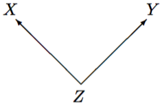
To illustrate a spurious association with a silly but memorable teaching example, suppose that we examine a sample of house fires in London, and record the number of fire engines sent to each incident (\(X\)) and the amount of damage caused by the fire (\(Y\)). There will be a strong association between \(X\) and \(Y\), with large numbers of fire engines associated with large amounts of damage. It is also reasonably clear that the number of fire engines is determined before the final extent of damage. The first two conditions discussed above are thus satisfied. We would, however, be unlikely to infer from this that the relationship is causal and conclude that we should try to reduce the cost of fires by dispatching fewer fire engines to them. This is because the association between the number of fire engines and the amount of damages is due to both of them being influenced by the size of the fire (\(Z\)). Here this is of course obvious, but in most real research questions possible spurious associations are less easy to spot.
How can we then rule out spurious associations due to some background variables \(Z\)? The usual approach is to try to remove the association between \(X\) and \(Z\). This means in effect setting up comparisons between units which have different values of \(X\) but the same or similar values of \(Z\). Any differences in \(Y\) can then more confidently be attributed to \(X\), because they cannot be due to differences in \(Z\). This approach is known as controlling for other variables \(Z\) in examining the association between \(X\) and \(Y\).
The most powerful way of controlling for background variables is to conduct a randomized experiment, where the values of the explanatory variable \(X\) can be set by the researcher, and are assigned at random to the units in the study. For instance, of the examples considered in Chapters 5 and 7, Examples 5.3, 5.4 and 7.3 are randomized experiments, each with an intervention variable \(X\) with two possible values (placebo or real vaccine, one of two forms of a survey question, and police officer wearing or not wearing sunglasses, respectively). The randomization assures that units with different values of \(X\) are on average similar in all variables \(Z\) which precede \(X\) and \(Y\), thus ruling out the possibility of spurious associations due to such variables.
Randomized experiments are for practical or ethical reasons infeasible in many contexts, especially in the social sciences. We may then resort to other, less powerful research designs which help to control for some background variables. This, however, is usually only partially successful, so we may also need methods of control applied at the analysis stage of the research process. This is known as statistical control. The aim of statistical control is to estimate and test associations between \(X\) and \(Y\) while effectively holding the values of some other variables \(Z\) constant in the analysis. When the response variable is continuous, the most common way of doing this is the method of multiple linear regression which is described in the next section. When all the variables are categorical, one simple way of achieving the control is analysis of multiway contingency tables, which is described in Chapter 9.
8.5 Multiple linear regression models
8.5.1 Introduction
Simple linear regression becomes multiple linear regression when more than one explanatory variable is included in the model. How this is done is explained in Section 8.5.2 below. The definition of the model builds directly on that of the simple linear model, and most of the elements of the multiple model are either unchanged or minimally modified from the simple one. As a result, we can in Section 8.5.3 cover much of the multiple linear model simply by referring back to the descriptions in Section 8.3. One aspect of the model is, however, conceptually expanded when there are multiple explanatory variables, and requires a careful discussion. This is the meaning of the regression coefficients of the explanatory variables. The interpretation of and inference for these parameters are discussed in Section 8.5.4. The crucial part of this interpretation, and the main motivation for considering multiple regression models, is that it is one way of implementing the ideas of statistical control in analyses for continuous response variables.
The concepts are be illustrated with a further example from the Global Civil Society data set. The response variable will still be the Infant mortality rate of a country, and there will be three explanatory variables: School enrolment, Control of corruption and Income inequality as measured by the Gini index (see Example 8.1). Results for this model are shown in Table 8.3, to which we will refer throughout this section. The table is also an example of the kind of format in which results of regression models are typically reported. Presenting raw computer output such as that in Figure 8.7 is normally not appropriate in formal research reports.
| Explanatory variable | Coefficient | Standard error | \(t\) | \(P\)-value | 95 % Confidence interval |
|---|---|---|---|---|---|
| Constant | 16.40 | ||||
| School enrolment (%) | -0.139 | 0.014 | -9.87 | \(<0.001\) | (-0.167; -0.111 ) |
| Control of corruption | -0.046 | 0.008 | -5.53 | \(<0.001\) | (-0.062; -0.029) |
| Income inequality | 0.055 | 0.022 | 2.50 | 0.014 | (0.011; 0.098) |
8.5.2 Definition of the model
Having multiple explanatory variables requires a slight extension of notation. Let us denote the number of explanatory variables in the model by \(k\); in our example \(k=3\). Individual explanatory variables are then denoted with subscripts as \(X_{1}\), \(X_{2}\), …, \(X_{k}\), in the example for instance as \(X_{1}=\) School enrolment, \(X_{2}=\) Control of corruption and \(X_{3}=\) Income inequality. Observations for individual units \(i\) (with values \(i=1,2,\dots,n\)) in the sample are indicated by a further subscript, so that \(X_{1i}, X_{2i}, \dots, X_{ki}\) denote the observed values of the \(k\) explanatory variables for unit \(i\).
The multiple linear regression model is essentially the same as the simple linear model. The values \(Y_{i}\) of the response variable in the sample are again assumed to be statistically independent, and each of them is regarded as an observation sampled from a normal distribution with mean \(\mu_{i}\) and variance \(\sigma^{2}\). The crucial change is that the expected values \(\mu_{i}\) now depend on the multiple explanatory variables through \[\begin{equation} \mu_{i} = \alpha +\beta_{1}X_{1i}+\beta_{2}X_{2i}+\dots+\beta_{k}X_{ki} \tag{8.15} \end{equation}\] where the coefficients \(\beta_{1}, \beta_{2}, \dots, \beta_{k}\) of individual explanatory variables are now also identified with subscripts. As in ((8.4)) for the simple linear model, the multiple model can also be expressed in the concise form \[\begin{equation} Y_{i} = \alpha+\beta_{1}X_{1i}+\beta_{2}X_{2i}+\dots+\beta_{k}X_{ki}+\epsilon_{i} \tag{8.16} \end{equation}\] where the error term (population residual) \(\epsilon_{i}\) is normally distributed with mean 0 and variance \(\sigma^{2}\).
The expected value of \(Y\) as defined in ((8.15)) is a linear function of \(X_{1}, X_{2}, \dots, X_{k}\). If there are two explanatory variables (\(k=2\)), \(\mu\) is described by a flat plane as \(X_{1}\) and \(X_{2}\) take different values (think of a flat sheet of paper, at an angle and extended indefinitely in all directions, cutting across a room in the air). A plane is the two-dimensional generalisation of a one-dimensional straight line. The actual observations of \(Y_{i}\) now correspond to points in a three-dimensional space, and they are generally not on the regression plane (think of them as a swarm of bees in the air, some perhaps sitting on that sheet of paper but most hovering above or below it). When \(k\) is larger than 2, the regression surface is a higher-dimensional linear object known as a hyperplane. This is impossible to visualise in our three-dimensional world, but mathematically the idea of the model remains unchanged. In each case, the observed values of \(Y\) exist in a yet higher dimension, so they cannot in general be predicted exactly even with multiple explanatory variables. A regression plane defined by several \(X\)-variables does nevertheless allow for more flexibility for \(\mu_{i}\) than a straight line, so it is in general possible to predict \(Y_{i}\) more accurately with a multiple regression model than a simple one. This, however, is not usually the only or main criterion for selecting a good regression model, for reasons discussed in Section 8.5.4 below.
8.5.3 Unchanged elements from simple linear models
As mentioned at the beginning of this section, most elements of the multiple linear regression model are the same or very similar as for the simple model, and require little further explanation:
The constant term (intercept) \(\alpha\) is interpreted as the expected value of \(Y\) when all of the explanatory variables have the value 0. This can be seen by setting \(X_{1i}, X_{2i}, \dots, X_{ki}\) all to 0 in ((8.15)). As before, \(\alpha\) is rarely of any substantive interest. In the example in Table 8.3, the estimated value of \(\alpha\) is 16.40.
The residual standard deviation \(\sigma\) is the standard deviation of the conditional distribution of \(Y\) given the values of all of \(X_{1}, X_{2}, \dots, X_{k}\). It thus describes the magnitude of the variability of \(Y\) around the regression plane. The model assumes that \(\sigma\) is the same at all values of the explanatory variables. In Table 8.3, the estimate of \(\sigma\) is 2.23.
-
Estimates of the regression coefficients are here denoted with hats as \(\hat{\alpha}\) and \(\hat{\beta}_{1}, \hat{\beta}_{2}, \dots, \hat{\beta}_{k}\), and fitted (predicted) values for \(Y_{i}\) are given by \[\begin{equation} \hat{Y}_{i}=\hat{\alpha}+\hat{\beta}_{1}X_{1i}+\hat{\beta}_{2}X_{2i}+\dots+\hat{\beta}_{k}X_{ki}. \tag{8.17} \end{equation}\] The estimated regression coefficients are again obtained with the method of least squares by finding the values for \(\hat{\alpha}, \hat{\beta}_{1}, \hat{\beta}_{2}, \dots, \hat{\beta}_{k}\) which make the error sum of squares \(SSE=\sum (Y_{i}-\hat{Y}_{i})^{2}\) as small as possible. This is both mathematically and intuitively the same exercise as least squares estimation for a simple linear model, except with more dimensions: here we are finding the best-fitting hyperplane through a high-dimensional cloud of points rather than the best-fitting straight line through a two-dimensional scatterplot.
With more than one explanatory variable, the computational formulas for the estimates become difficult to write down52 and essentially impossible to calculate by hand. This is not a problem in practice, as they are easily computed by statistical software such as SPSS. In Table 8.3, the least squares estimates of the regression coefficients are shown in the “Coefficient” column. Each row of the table gives the coefficient for one explanatory variable, identified in the first column. A similar format is adopted in SPSS output, where the “Coefficients” table looks very similar to the main part of Table 8.3. The arrangement of other parts of SPSS output for multiple linear regression is essentially unchanged from the format shown in Figure 8.7.
Predicted values for \(Y\) can be calculated from ((8.17)) for any set of values of the explanatory variables (whether those observed in the data or not, as long as extrapolation outside their observed ranges is avoided). This is often very useful for illustrating the implications of a fitted model. For example, Table 8.2 shows that the sample averages of the explanatory variables in Table 8.3 are approximately 86 for School enrolment (\(X-{1}\)), 50 for Control of corruption (\(X_{2}\)) and 40 for Income inequality (\(X_{3}\)). The predicted IMR for a hypothetical “average” country with all these values would be \[\hat{Y}=16.4-0.139\times 86-0.046\times 50+0.055\times 40=4.35\] using the estimated intercept \(\hat{\alpha}=16.4\), and the estimated regression coefficients \(\hat{\beta}_{1}=-0.139\), \(\hat{\beta}_{2}=-0.046\) and \(\hat{\beta}_{3}=0.055\) for \(X_{1}\), \(X_{2}\) and \(X_{3}\). For further illustration, we might compare this to other predicted values calculated for, say, different combinations of large and/or small values of the explanatory variables.
The estimated residual standard error \(\hat{\sigma}\) is again calculated from ((8.7)), using the appropriate value of \(k\). Here \(n=111\) and \(k=3\), and so the degrees of freedom are \(df=n-(k+1)=n-4=107\). The estimate is \(\hat{\sigma}=2.23\).
The explanation of the coefficient of determination \(R^{2}\) is entirely unchanged from the one given under “Coefficient of determination (\(R^{2}\))” in Section 8.3.4. It is still calculated with the formula ((8.9)), and its interpretation is also the same. The \(R^{2}\) statistic thus describes the proportion of the sample variation in \(Y\) explained by the regression model, i.e. by the variation in the explanatory variables. Similarly, the multiple correlation coefficient \(R=\sqrt{R^{2}}\) is again the correlation between the observed \(Y_{i}\) and the fitted values \(\hat{Y}_{i}\). In our example, \(R^{2}=0.692\) (and \(R=\sqrt{0.692}=0.832\)), i.e. about 69.2% of the observed variation in IMR between countries is explained by the variation in levels of School enrolment, Control of corruption and Income inequality between them. Compared to the \(R^{2}=0.567\) for the simple regression model in Figure 8.7, adding the two new explanatory variables has increased \(R^{2}\) by 12.5 percentage points, which seems like a reasonably large increase.
8.5.4 Interpretation and inference for the regression coefficients
Interpretation
The concept of statistical control was outlined in Section 8.4 above. In essence, its idea is to examine the association between a response variable and a particular explanatory variable, while holding all other explanatory variables at constant values. This is useful for assessing claims about causal effects, but also more broadly whenever we want to analyse associations free of the confounding effects of other variables.
When all of the variables were categorical, statistical control could be carried out obviously and transparently by considering partial tables, where the control variables are literally held constant. This is not possible when some of the control variables are continuous, because they then have too many different values for it to be feasible to consider each one separately. Instead, statistical control is implemented with the help of a multiple regression model, and interpreted in terms of the regression coefficients.
Consider, for example, a linear regression model with three explanatory variables \(X_{1}\), \(X_{2}\) and \(X_{3}\). This specifies the expected value of \(Y\) as \[\begin{equation} \mu=\alpha+\beta_{1}X_{1}+\beta_{2}X_{2}+\beta_{3}X_{3} \tag{8.18} \end{equation}\] for any values of \(X_{1}\), \(X_{2}\) and \(X_{3}\). Suppose now that we consider a second observation, which has the same values of \(X_{1}\) and \(X_{2}\) as before, but the value of \(X_{3}\) larger by one unit, i.e. \(X_{3}+1\). The expected value of \(Y\) is now \[\begin{equation} \mu=\alpha+\beta_{1}X_{1}+\beta_{2}X_{2}+\beta_{3}(X_{3}+1)=\alpha+\beta_{1}X_{1}+\beta_{2}X_{2}+\beta_{3}X_{3}+\beta_{3}. \tag{8.19} \end{equation}\] Subtracting ((8.18)) from ((8.19)) leaves us with \(\beta_{3}\). In other words, \(\beta_{3}\) is the change in expected value of \(Y\) when \(X_{3}\) is increased by one unit, while keeping the values of \(X_{1}\) and \(X_{2}\) unchanged. The same result would obviously be obtained for \(X_{1}\) and \(X_{2}\), and for models with any number of explanatory variables. Thus in general
- The regression coefficient of any explanatory variable in a multiple linear regression model shows the change in expected value of the response variable \(Y\) when that explanatory variable is increased by one unit, while holding all other explanatory variables constant.
When there is only one explanatory variable, the “while holding…” part is omitted and the interpretation becomes the one for simple linear regression in Section 8.3.3.
This interpretation of the regression coefficients is obtained by “increasing by one unit” and “holding constant” values of explanatory variables by mathematical manipulations alone. It is thus true within the model even when the values of the explanatory variables are not and cannot actually be controlled and set at different values by the researcher. This, however, also implies that this appealing interpretation is a mathematical construction which does not automatically correspond to reality. In short, the interpretation of the regression coefficients is always mathematically true, but whether it is also an approximately correct description of an association in the real world depends on the appropriateness of the model for the data and study at hand. In some studies it is indeed possible to manipulate at least some explanatory variables, and corresponding regression models can then help to draw reasonably strong conclusions about associations between variables. Useful results can also be obtained in studies where no variables are in our control (so-called observational studies), as long as the model is selected carefully. This requires, in particular, that a linear model specification is adequate for the data, and that no crucially important explanatory variables have been omitted from the model.
In the IMR example, the estimated coefficients in Table 8.3 are interpreted as follows:
Holding levels of Control of corruption and Income inequality constant, increasing School enrolment by one percentage point decreases expected IMR by 0.139 percentage points.
Holding levels of School enrolment and Income inequality constant, increasing Control of corruption by one unit decreases expected IMR by 0.046 percentage points.
Holding levels of School enrolment and Control of corruption constant, increasing Income inequality by one unit increases expected IMR by 0.055 percentage points.
Instead of “holding constant”, we often talk about “controlling for” other variables in such statements. As before, it may be more convenient to express the interpretations in terms of other increments than one unit (e.g. ten units of the measure of Income inequality) by multiplying the coefficient by the correponding value.
The association between the response variable \(Y\) and a particular explanatory variable \(X\) described by the coefficient of \(X\) in a multiple regression model is known as a partial association between \(X\) and \(Y\), controlling for the other explanatory variables in the model. This will often differ from the association estimated from a simple regression model for \(Y\) given \(X\), because of the correlations between the control variables and \(X\) and \(Y\). In the infant mortality example, the estimated effect of School enrolment was qualitatively unaffected by controlling for the other variables, and decreased in magnitude from -0.179 to -0.139.
Inference
Inference for the regression coefficients in a multiple linear model differs from that for the simple model in interpretation but not in execution. Let \(\hat{\beta}_{j}\) denote the estimated coefficient of an explanatory variable \(X_{j}\) (where \(j\) may be any of \(1,2,\dots,k\)), and let \(\hat{\text{se}}(\hat{\beta}_{j})\) denote its estimated standard error. The standard errors cannot now be calculated by hand, but they are routinely produced by computer packages and displayed as in Table 8.3. A \(t\)-test statistic for the null hypothesis discussed below is given by \[\begin{equation} t=\frac{\hat{\beta}_{j}}{\hat{\text{se}}(\hat{\beta}_{j})}. \tag{8.20} \end{equation}\] This is identical in form to statistic ((8.13)) for the simple regression model. The corresponding null hypotheses are, however, subtly but crucially different in the two cases. In a multiple model, ((8.20)) is a test statistic for the null hypothesis \[\begin{equation} H_{0}:\; \beta_{j}=0, \text{other regression coefficients are unrestricted} \tag{8.21} \end{equation}\] against the alternative hypothesis \[H_{a}:\; \beta_{j}\ne0, \text{other regression coefficients are unrestricted}.\] Here the statement about “unrestricted” other parameters implies that neither hypothesis makes any claims about the values of other coefficients than \(\beta_{j}\), and these are allowed to have any values. The null hypothesis is a claim about the association between \(X_{j}\) and \(Y\) when the other explanatory variables are already included in the model. In other words, ((8.20)) tests \[\begin{aligned} H_{0}:& & \text{There is no partial association between } X_{j} \text{ and } Y,\\ && \text{controlling for the other explanatory variables.}\end{aligned}\]
The sampling distribution of ((8.20)) when the null hypothesis ((8.21)) holds is a \(t\) distribution with \(n-(k+1)\) degrees of freedom, where \(k\) is again the number of explanatory variables in the model. The test statistic and its \(P\)-value from the \(t_{n-(k+1)}\) distribution are shown in standard computer output, in a form similar to Table 8.3.
It is important to note two things about test results for multiple regression models, such as those in Table 8.3. First, ((8.21)) implies that if the null hypothesis is not rejected, \(X_{j}\) is not associated with \(Y\), if the other explanatory variables are already included in the model. We would typically react to this by removing \(X_{j}\) from the model, while keeping the other variables in it. This is because of a general principle that models should usually be as simple (parsimonious) as possible, and not include variables which have no partial effect on the response variable. Second, the \(k\) tests and \(P\)-values actually refer to \(k\) different hypotheses of the form ((8.21)), one for each explanatory variable. This raises the question of what to do if, say, tests for two variables have large \(P\)-values, suggesting that either of them could be removed from the model. The appropriate reaction is to remove one of the variables (perhaps the one with the larger \(P\)-value) rather than both at once, and then see whether the other still remains nonsignificant (if so, it can then also be removed). This is part of the general area of model selection, principles and practice of which are mostly beyond the scope of this course; some further comments on it are given in Section 8.7.
In the example shown in Table 8.3, the \(P\)-values are small for the tests for all of the coefficients. Each of the three explanatory variables thus has a significant effect on the response even after controlling for the other two, so none of the variables should be removed from the model.
A confidence interval with confidence level \(1-\alpha\) for any \(\beta_{j}\) is given by \[\begin{equation} \hat{\beta}_{j} \pm t_{\alpha/2}^{(n-(k+1))} \,\hat{\text{se}}(\hat{\beta}_{j}). \tag{8.22} \end{equation}\] This is identical in form and interpretation to the interval ((8.14)) for simple regression (except that the degrees of freedom are now \(df=n-(k+1)\)), so no new issues arise. The confidence intervals for the coefficients in our example (where \(df=n-4=107\) and \(t_{0.025}^{(107)}=1.98\)) are shown in Table 8.3.
8.6 Including categorical explanatory variables
8.6.1 Dummy variables
Our models for Infant mortality rate so far did not include some more basic characteristics of the countries than school enrolment, corruption and income inequality. In particular, it seems desirable to control for the wealth of a country, which is likely to be correlated with both a health outcome like infant mortality and the other measures of development used as explanatory variables. We will do this by adding to the model the income level of the country, classified in the Global Civil Society Yearbook into three groups as Low, Middle or High income. Here one reason for considering income as a categorical variable is obviously to obtain an illustrative example for this section. However, using a variable like income in a grouped form is also more generally common practice. It also has the advantage that it is one way of dealing with cases where the effects on \(Y\) of the corresponding continuous explanatory variable may be nonlinear.
Summary statistics in Table 8.2 show that income group is associated with both IMR and the explanatory variables considered so far: countries with higher income tend to have lower levels of infant mortality, and higher school enrolment, less corruption and less income inequality than lower-income countries. It thus seems that controlling for income is potentially necessary, and may change the conclusions from the model.
Trying to add income level to the model confronts us with a new problem: how can a categorical explanatory variable like this be used in linear regression? This question is not limited to the current example, but is unavoidable in the social sciences. Even just the standard background variables such as sex, marital status, education level, party preference, employment status and region of residence considered in most individual-level studies are mostly categorical. Similarly, most survey data on attitudes and behaviour are collected in a categorical form, and even variables such as age or income which are originally continuous are often used in a grouped form. Categorical variables are thus ubiquitous in the social sciences, and it is essential to be able to use them also in regression models. How this is done is explained in this section, again illustrated with the infant mortality example. Section 8.6.2 then describes a different example for further illustration of the techniques.
The key to handling categorical explanatory variables is the use of dummy variables. A dummy variable (or indicator variable) is a variable with only two values, 0 and 1. Its value is 1 if a unit is in a particular category of a categorical variable, and 0 if it is not in that category. For example, we can define for each country the variable \[D_{m}=\begin{cases} 1 & \text{if Income level is ``Middle''} \\ 0 & \text{otherwise.} \end{cases}\] This would typically be referred to as something like “dummy for middle income level”. Note that the label \(D_{m}\) used here has no special significance, and was chosen simply to make it easy to remember. Dummy variables will be treated below as regular explanatory variables, and we could denote them as \(X\)s just like all the others. A dummy for high income level is defined similarly as \[D_{h}=\begin{cases} 1 & \text{if Income level is ``High''} \\ 0 & \text{otherwise.} \end{cases}\] The two variables \(D_{m}\) and \(D_{h}\) are enough to identify the income level of any country. If a country is in the middle-income group, the two dummies have the values \(D_{m}=1\) and \(D_{h}=0\) (as no country can be in two groups), and if it has high income, the dummies are \(D_{m}=0\) and \(D_{h}=1\). For low-income countries, both \(D_{m}=0\) and \(D_{h}=0\). There is thus no need to define a dummy for low income, because this category is identified by the two other dummies being both zero. The same is true in general: if a categorical variable has \(K\) categories, only \(K-1\) dummy variables are needed to identify the category of every unit. Note, in particular, that dichotomous variables with only two categories (\(K=2\)) are fully identified by just one dummy variable. The category which is not given a dummy of its own is known as the reference category or baseline category. Any category can be the baseline, and this is usually chosen in a way to make interpretation (discussed below) convenient. The results of the model will be the same, whichever baseline is used.
Categorical variables are used as explanatory variables in regression models by including the dummy variables for them in the model. The results for this in our example are shown in Table 8.4. This requires no changes in the definition or estimation of the model, and the parameter estimates, standard errors and quantities for statistical inference are obtained exactly as before even when some of the explanatory variables are dummy variables. The only aspect which requires some further explanation is the interpretation of the coefficients of the dummy variables.
| Explanatory variable | Coefficient | Std. error | \(t\) | \(P\)-value | 95 % Conf. interval |
|---|---|---|---|---|---|
| Constant | 12.00 | ||||
| School enrolment (%) | \(-0.091\) | 0.016 | \(-5.69\) | \(<0.001\) | \((-0.123; -0.059)\) |
| Control of corruption | \(-0.020\) | 0.011 | \(-1.75\) | \(0.083\) | \((-0.043; 0.003)\) |
| Income inequality | 0.080 | 0.021 | 3.75 | \(<0.001\) | (0.038; 0.122) |
| Income level (Reference group: Low) | |||||
| Middle | \(-3.210\) | 0.631 | \(-5.09\) | \(<0.001\) | \((-4.461; -1.958)\) |
| High | \(-3.296\) | 1.039 | \(-3.17\) | 0.002 | \((-5.357; -1.235)\) |
Recall that the regression coefficient of a continuous explanatory variable \(X\) is the expected change in the response variable when \(X\) is increased by one unit, holding all other explanatory variables constant. Exactly the same interpretation works for dummy variables, except that it is limited to the only one-unit increase possible for them, i.e. from 0 to 1. For example, consider two (hypothetical) countries with values 0 and 1 for the dummy \(D_{m}\) for middle income, but with the same values for the three continuous explanatory variables. How about the other dummy variable \(D_{h}\), for high income? The interpretation requires that this too is held constant in the comparison. If this constant value was 1, it would not be possible for \(D_{m}\) to be 1 because every country is in only one income group. Thus the only value at which \(D_{h}\) can be held constant while \(D_{m}\) is changed is 0, so that the comparison will be between a country with \(D_{m}=1, \, D_{h}=0\) and one with \(D_{m}=0,\, D_{h}=0\), both with the same values of the other explanatory variables. In other words, the interpretation of the coefficient of \(D_{m}\) refers to a comparison in expected value of \(Y\) between a middle-income country and a country in the baseline category of low income, controlling for the other explanatory variables. The same applies to the coefficient of \(D_{h}\), and of dummy variables in general:
- The coefficient of a dummy variable for a particular level of a categorical explanatory variable is interpreted as the difference in the expected value of the response variable \(Y\) between a unit with that level of the categorical variable and a unit in the baseline category, holding all other explanatory variables constant.
Here the estimated coefficient of \(D_{m}\) is \(-3.21\). In other words, comparing a middle-income country and a low-income country, both with the same levels of School enrolment, Control of corruption and Income inequality, the expected IMR is 3.21 percentage points lower in the middle-income country than in the low-income one. Similarly, a high-income country has an expected IMR 3.296 percentage points lower than a low-income one, other things being equal. The expected difference between the two non-reference levels is obtained as the difference of their coefficients (or by making one of them the reference level, as discussed below); here \(-3.296-(-3.210)=-0.086\), so a high-income country has an expected IMR 0.086 percentage points lower than a middle-income one, controlling for the other explanatory variables.
Predicted values are again obtained by substituting values for the explanatory variables, including appropriate zeros and ones for the dummy variables, into the estimated regression equation. For example, the predicted IMR for a country with School enrolment of 86 %, Control of corruption score of 50 and Income inequality of 40 is \[\begin{aligned} \hat{Y}&=&12.0-0.091\times 86-0.020\times 50+0.080\times 40-3.210\times 0-3.296\times 0\\ &=& 6.37 \text{for a low-income country, and }\\ \hat{Y}&=&12.0-0.091\times 86-0.020\times 50+0.080\times 40-3.210\times 1-3.296\times 0\\ &=& 6.37-3.21=3.16 \text{for a middle-income country,}\end{aligned}\] with a difference of 3.21, as expected. Note how the constant term 12.0 sets the level for the baseline (low-income) group, and the coefficient \(-3.21\) shows the change from that level when considering a middle-income country instead. Note also that we should again avoid unrealistic combinations of the variables in such predictions. For example, the above values would not be appropriate for high-income countries, because there are no such countries in these data with Control of corruption as low as 50.
The choice of the reference category does not affect the fitted model, and exactly the same results are obtained with any choice. For example, if high income is used as the reference category instead, the coefficients of the three continuous variables are unchanged from Table 8.4, and the coefficients of the dummy variables for low and middle incomes are 3.296 and 0.086 respectively. The conclusions from these are the same as above: controlling for the other explanatory variables, the difference in expected IMR is 3.296 between low and high-income, 0.086 between middle and high-income and \(3.296-0.086=3.210\) between low and middle-income countries. Because the choice is arbitrary, the baseline level should be selected in whichever way is most convenient for stating the interpretation. If the categorical variable is ordinal (as it is here), it makes most sense for the baseline to be the first or last category. In other ways the dummy-variable treatment makes no distinction between nominal and ordinal categorical variables. Both are treated effectively as nominal in fitting the model, and information on any ordering of the categories is ignored.
Significance tests and confidence intervals are obtained for coefficients of dummy variables exactly as for any regression coefficients. Since the coefficient is in this case interpreted as an expected difference between a level of a categorical variable and the reference level, the null hypothesis of a zero coefficient is the hypothesis that there is no such difference. For example, Table 8.4 shows that the coefficients of both the middle income and high income dummies are clearly significantly different from zero. This shows that, controlling for the other explanatory variables, expected infant mortality for both middle and high-income countries is different from that in low-income countries. The 95% confidence intervals in Table 8.4 are intervals for this difference.
On the other hand, the coefficients of the two higher groups are very similar, which suggests that they may not be different from each other. This can be confirmed by fitting the same model with high income as the reference level, including dummies for low and middle groups. In this model (not shown here), the coefficient of the middle income dummy corresponds to the difference of the Middle and High groups. Its \(P\)-value is 0.907 and 95% confidence interval \((-1.37; 1.54)\), so the difference is clearly not significant. This suggests that we could simplify the model further by combining the two higher groups and considering only two income groups, low vs. middle/high.
In cases like this where a categorical explanatory variable has more than two categories, \(t\)-tests of individual coefficients are tests of hypotheses about no differences between individual categories, not the hypothesis that the variable has no effect overall. This is the hypothesis that the coefficients of the dummies for all of the categories are zero. This requires a slightly different test, which will not be considered here. In our example the low income category is so obviously different from the other two that it is clear that the hypothesis of no overall income effect would be rejected.
The main reason for including income group in the example was not to study income effects themselves (it is after all not all that surprising that infant mortality is highest in poor countries), but to control for them when examining partial associations between IMR and the other explanatory variables. These describe the estimated effects of these continuous variables when comparing countries with similar income levels. Comparing the results in Tables 8.3 and 8.4, it can be seen that the effect of School enrolment remains significant and negative (with higher enrolment associated with lower mortality), although its magnitude decreases somewhat after controlling for income group. Some but not all of its estimated effect in the first model is thus explained away by the fact that income is associated with both primary school enrolment and infant mortality, with richer countries having both higher enrolment and lower mortality.
The effect of Income inequality also remains significant in the larger model, even with a slightly increased coefficient. Countries with larger income inequality tend to have higher levels of infant mortality, even when we compare countries with similar levels of income. The effect of Control of corruption, on the other hand, is no longer significant in Table 8.4. This variable is strongly associated with income (as seen in Table 8.2), with the more corrupt countries typically being poor. Controlling for income, however, level of corruption appears to have little further effect on infant mortality. This also suggests that we might simplify the model by omitting the corruption variable.
One final remark on dummy variables establishes a connection to the techniques discussed in Chapter 7. There we described statistical inference for comparisons of the population means of a continuous response variable \(Y\) between two groups, denoted 1 and 2. Suppose now that we fit a simple linear regression model for \(Y\), with a dummy variable for group 2 as the only explanatory variable. This gives exactly the same results as the two-sample \(t\)-tests and confidence intervals (under the assumption of equal variances in the groups) in Section 7.3. Related to the notation of that section, the coefficients from the model are \(\hat{\alpha}=\bar{Y}_{1}\), \(\hat{\beta}=\bar{Y}_{2}-\bar{Y}_{1}\), and \(\hat{\sigma}\) from ((8.7)) is equal to (see equation 11 in Section 7.3.2). Similarly, the standard error ((8.12)) is the same as \(\hat{\sigma}_{\hat{\Delta}}\) in the standard error equation in Section 7.3.2, and the test statistic ((8.13)) and confidence interval ((8.14)) are identical with the t-test statistic in Section 7.3.2 and the \(t\) distribution version of the equation in Section 7.3.3 respectively.
The connection between linear regression and the two-sample \(t\)-test is an illustration of how statistical methods are not a series of separate tricks for different situations, but a set of connected procedures unified by common principles. Whenever possible, methods for more complex problems have been created by extending those for simpler ones, and simple analyses are in turn special cases of more general ones. Although these connections are unfortunately often somewhat obscured by changes in language and notation, trying to understand them is very useful for effective learning of statistics.
8.6.2 A second example
Because the analysis of the models for infant mortality was presented piecemeal to accompany the introduction of different elements of linear regression, an overall picture of that example may have been difficult to discern. This section describes a different analysis in a more concise manner. It is particularly an illustration of the use of dummy variables, as most of the explanatory variables are categorical. The example concerns the relationship between minimum wage and employment, and uses data originally collected and analysed by David Card and Alan Krueger.53 Most of the choices of analyses and variables considered here are based on those of Card and Krueger. Their article should be consulted for discussion and more detailed analyses.
A minimum wage of $5.05 per hour came into effect in the U.S. state of New Jersey on April 1 1992. This represented an increase from the previous, federally mandated minimum wage of $4.25 per hour. Conventional economic theory predicts that employers will react to such an increase by cutting their work force. Here the research hypothesis is thus that employment will be reduced among businesses affected by the new minimum wage. This can be addressed using suitable data, examining a statistical hypothesis of no association between measures of minimum wage increase and change of employment, controlling for other relevant explanatory variables.
Card and Krueger collected data for 410 fast food restaurants at two times, about one month before and eight months after the mininum wage increase came into effect in New Jersey. Only the 368 restaurants with known values of all the variables used in the analyses are included here. Of them, 268 were in New Jersey and had starting wages below $5.05 at the time of the first interview, so that these had to be increased to meet the new minimum wage. The remaining 100 restaurants provide a control group which was not affected by the change: 75 of them were in neighbouring eastern Pennsylvania where the minimum wage remained at $4.25, and 25 were in New Jersey but had starting wages of at least $5.05 even before the increase. The theoretical prediction is that the control group should experience a smaller negative employment change than the restaurants affected by the wage increase, i.e. employment in the control restaurants should not decrease or at least decrease less than in the affected restaurants. Card and Krueger argue that fast food restaurants provide a good population for examining the research question, because they employ many low-wage workers, generally comply with minimum wage legislation, do not receive tips which would complicate wage calculations, and are relatively easy to sample and interview.
The response variable considered here is the change between the two interviews in full-time equivalent employment at the restaurant, defined as the number of full-time workers (including managers) plus half the number of part-time workers. This will be called “Employment change” below. We consider two variables which indicate how the restaurant was affected by the minimum wage increase. The first is simply a dummy variable which is 1 for those New Jersey restaurants where wages needed to be raised because of the increase, and 0 for the other restaurants. These will be referred to as “Affected” and “Unaffected” restaurants respectively. The second variable is also 0 for the unaffected restaurants; for the affected ones, it is the proportion by which their previous starting wage had to be increased to meet the new minimum wage. For example, if the previous starting wage was the old minimum of $4.25, this “Wage gap” is \((5.05-4.25)/4.25=0.188\). Finally, we will also use information on the chain the restaurant belongs to (Burger King, Roy Rogers, Wendy’s or KFC) and whether it is owned by the parent company or the franchisee. These will be included in the analyses as partial control for other factors affecting the labour market, which might have had a differential impact on different types of restaurants over the study period. Summary statistics for the variables are shown in Table 8.5.
| Minimum- | wage variable | Response variable: | |||
| Group | % | \((n)\) | Affected % (\(n\)) | Wage gap (mean for affected restaurants) | Employment change (mean) |
| Overall | 100 | (368) | 72.8 (268) | 0.115 | \(-0.30\) |
| Ownership | |||||
| Franchisee | 64.7 | (238) | 71.8 (171) | 0.122 | \(-0.17\) |
| Company | 35.3 | (130) | 74.6 (97) | 0.103 | \(-0.52\) |
| Chain | |||||
| Burger King | 41.0 | (151) | 73.5 (111) | 0.129 | \(+0.02\) |
| Roy Rogers | 24.7 | (91) | 72.5 (66) | 0.104 | \(-1.89\) |
| Wendy’s | 13.0 | (48) | 60.4 (29) | 0.086 | \(-0.28\) |
| KFC | 21.2 | (78) | 79.5 (62) | 0.117 | \(+0.94\) |
:(#tab:t-fastfood-descr)Summary statistics for the variables considered in the minimum wage example of Section 8.6.2. Mean employment change: Among unaffected restaurants: \(-2.93\); Among affected restaurants: \(+0.68\).
| Model (1) Coefficient (std error) |
(\(t\)) \(P\)-value |
Model (2) Coefficient (std error) |
(\(t\)) \(P\)-value |
|
|---|---|---|---|---|
| Constant | ||||
| -2.63 | -1.54 | |||
| Affected by the increase | 3.56 | (3.50) | — | — |
| (1.02) | 0.001 | — | — | |
| Wage gap | — | — | 15.88 | (2.63) |
| — | — | (6.04) | 0.009 | |
| Ownership (vs. Franchisee) | ||||
| Company | 0.22 | (0.20) | 0.43 | (0.40) |
| (1.06) | 0.84 | (1.07) | 0.69 | |
| Chain (vs. Burger King) | ||||
| Roy Rogers | -2.00 | (-1.56) | -1.84 | (-1.43) |
| (1.28) | 0.12 | (1.29) | 0.15 | |
| Wendy’s | 0.15 | (0.11) | 0.36 | (0.24) |
| (1.44) | 0.92 | (1.46) | 0.81 | |
| KFC | 0.64 | (0.51) | 0.81 | (0.64) |
| (1.25) | 0.61 | (1.26) | 0.52 | |
| \(R^{2}\) | 0.046 | 0.032 |
Table 8.6 shows results for two linear regression models for Employment change, one using the dummy for affected restaurants and one using Wage gap as an explanatory variable. Both include the same dummy variables for ownership and chain of the restaurant. Consider first the model in column (1), which includes the dummy variable for affected restaurants. The estimated coefficient of this is 3.56, which is statistically significant (with \(t=3.50\) and \(P=0.001\)). This means that the estimated expected Employment change for the restaurants affected by the minimum wage increase was 3.56 full-time equivalent employees larger (in the positive direction) than for unaffected restaurants, controlling for the chain and type of ownership of the restaurant. This is the opposite of the theoretical prediction that the difference would be negative, due to the minimum wage increase leading to reductions of work force among affected restaurants but little change for the unaffected ones. In fact, the summary statistics in Table 8.5 show (although without controlling for chain and ownership) that average employment actually increased in absolute terms among the affected restaurants, but decreased among the unaffected ones.
The coefficients of the control variables in Table 8.6 describe estimated differences between company-owned and franchisee-owned restaurants, and between Burger Kings and restaurants of other chains, controlling for the other variables in the model. All of these coefficients have high \(P\)-values for both models, suggesting that the differences are small. In fact, the only one which is borderline significant, after all the other control dummies are successively removed from the model (not shown here), is that Employment change seems to have been more negative for Roy Rogers restaurants than for the rest. This side issue is not investigated in detail here. In any case, the control variables have little influence on the effect of the variable of main interest: if all the control dummies are removed from Model (1), the coefficient of the dummy variable for affected restaurants becomes 3.61 with a standard error of 1.01, little changed from the estimates in Table 8.6. This is not entirely surprising, as the control variables are weakly associated with the variable of interest: as seen in Table 8.5, the proportions of affected restaurants are mostly fairly similar among restaurants of all chains and types of ownership.
In their article, Card and Krueger carefully explore (and confirm) the robustness of their findings by considering a series of variants of the analysis, with different choices of variables and sets of observations. This is done to try to rule out the possibility that the main conclusions are reliant on, and possibly biased by, some specific features of the data and variables in the initial analysis, such as missing data or measurement error. Such sensitivity analyses would be desirable in most social science contexts, where single definitely best form of analysis is rarely obvious. Here we will carry out a modest version of such an assessment by considering the Wage gap variable as an alternative measure of the impact of minimum wage increase, instead of a dummy for affected restaurants. This is a continuous variable, but one whose values are 0 for all unaffected restaurants and vary only among the affected ones. The logic of using Wage gap as an explanatory variable here is that Employment change could be expected to depend not only on whether a restaurant had to increase its starting wage to meet the new minimum wage, but also on how large that compulsory increase was.
The results for the second analysis are shown as Model (2) in Table 8.6. The results are qualitatively the same as for Model (1), in that the coefficients of the control dummies are not significant, and that of Wage gap (which is 15.88) is significant and positive. The estimated employment change is thus again larger for affected than for unaffected restaurants, and their difference now even increases when the wage rise required from an affected restaurant increases. To compare these results more directly to Model (1), we can consider a comparison between an unaffected restaurant (with Wage gap 0) and an affected one with Wage gap equal to its mean among the affected restaurants, which is 0.115 (c.f. Table 8.5). The estimated difference in Employment change between them, controlling for ownership and chain, is \(0.115\times 15.88=1.83\), which is somewhat lower than the 3.56 estimated from model (1).
This example is also a good illustration of the limitations of the \(R^{2}\) statistic. The \(R^{2}\) values of 0.046 and 0.032 are very small, so over 95% of the observed variation in employment changes remains unexplained by the variation in the three explanatory variables. In other words, there are large differences in Employment change experienced even by affected or unaffected restaurants of the same chain and type of ownership. This would make predicting the employment change for a particular restaurant a fairly hopeless task with these explanatory variables. However, prediction is not the point here. The research question focuses on possible differences in average changes in employment, and finding such differences is of interest even if variation around the averages is large.
In summary, the analysis provides no support for the theoretical prediction that the restaurants affected by a minimum wage increase would experience a larger negative job change than control restaurants. In fact, there was a small but significant difference in the opposite direction in both models described here, and in all of the analyses considered by Card and Krueger. The authors propose a number of tentative explanations for this finding, but do not present any of them as definitive.
8.7 Other issues in linear regression modelling
The material in this chapter provides a reasonably self-contained introduction to linear regression models. However, it is not possible for a course like this to cover comprehensively all aspects of the models, so some topics have been described rather superficially and several have been omitted altogether. In this section we briefly discuss some of them. First, three previously unexplained small items in standard SPSS output are described. Second, a list of further topics in linear regression is given.
An example of SPSS output for linear regression models was given in Figure 8.7. Most parts of it have been explained above, but three have not been mentioned. These can be safely ignored, because each is of minor importance in most analyses. However, it is worth giving a brief explanation so as not to leave these three as mysteries:
“Adjusted R Square” in the “Model Summary” table is a statistic defined as \(R^{2}_{adj}=[(n-1)R^{2}-k]/(n-k-1)\). This is most relevant in situations where the main purpose of the model is prediction of future observations of \(Y\). The population value of the \(R^{2}\) statistic is then a key criterion of model selection. \(R^{2}_{adj}\) is a better estimate of it than standard \(R^{2}\). Unlike \(R^{2}\), \(R^{2}_{adj}\) does not always increase when new explanatory variables are added to the model. As a sample statistic, \(R^{2}_{adj}\) does not have the same interpretation as the proportion of variation of \(Y\) explained as standard \(R^{2}\).
The last two columns of the “ANOVA” (Analysis of Variance) table show the test statistic and \(P\)-value for the so-called \(F\)-test.54 The null hypothesis for this is that the regression coefficients of all the explanatory variables are zero, i.e. \(\beta_{1}=\beta_{2}=\dots=\beta_{k}=0\). In the case of simple regression (\(k=1\)), this is equivalent to the \(t\)-test for \(\beta=0\). In multiple regression, it implies that none of the explanatory variables have an effect on the response variable. In practice, this is rejected in most applications. Rejecting the hypothesis implies that at least one of the explanatory variables is associated with the response, but the test provides no help for identifying which of the individual partial effects are significant. The \(F\)-test is thus usually largely irrelevant. More useful is an extended version of it (which is not included in the default output), which is used for hypotheses that a set of several regression coefficients (but not all of them) is zero. For example, this could be used in the example of Table 8.4 to test if income level had no effect on IMR, i.e. if the coefficients of the dummies for both middle and high income were zero.
-
The “Standardized Coefficients/Beta” in the “Coefficients” table are defined as \((s_{xj}/s_{y})\hat{\beta}_{j}\), where \(\hat{\beta}_{j}\) is the estimated coefficient of \(X_{j}\), and \(s_{xj}\) and \(s_{y}\) are sample standard deviations of \(X_{j}\) and \(Y\) respectively. This is equal to the correlation of \(Y\) and \(X_{j}\) when \(X_{j}\) is the only explanatory variable in the model, but not otherwise. The standardized coefficient describes the expected change in \(Y\) in units of its sample standard error, when \(X_{j}\) is increased by one standard error \(s_{xj}\), holding other explanatory variables constant. The aim of this exercise is to obtain coefficients which are more directly comparable between different explanatory variables. Ultimately it refers to the question of relative importance of the explanatory variables, i.e. “Which of the explanatory variables in the model is the most important?” This is understandably of interest in many cases, often perhaps more so than any other aspect of the model. Unfortunately, however, relative importance is also one of the hardest questions in modelling, and one without a purely statistical solution. Despite their appealing title, standardized coefficients have problems of their own and do not provide a simple tool for judging relative importance. For example, their values depend not only on the strength of association described by \(\hat{\beta}_{j}\) but also on the standard deviation \(s_{xj}\), which can be different in different samples.
Sensible comparisons of the magnitudes of expected changes in \(Y\) in response to changes in individual explanatory variables can usually be presented even without reference to standardized coefficients, simply by using the usual coefficients \(\hat{\beta}_{j}\) and carefully considering the effects of suitably chosen increments of the explanatory variables. In general, it is also worth bearing in mind that questions of relative importance are often conceptually troublesome, for example between explanatory variables with very different practical implications. For instance, suppose that we have fitted a model for a measure of the health status of a person, given the amount of physical exercise the person takes (which can be changed by him/herself), investment in preventive healthcare in the area where the person lives (which can be changed, but with more effort and not by the individual) and the person’s age (which cannot be manipulated at all). The values of the unstandardized or standardized coefficients of these explanatory variables can certainly be compared, but it is not clear what statements about the relative sizes of the effects of “increasing” them would really mean.
A further course on linear regression (e.g. first half of MY452) will typically examine the topics covered on this course in more detail, and then go on to discuss further issues. Here we will give just a list of some such topics, in no particular order:
Model diagnostics to examine whether a particular model appears to be adequate for the data. The residuals \(Y_{i}-\hat{Y}_{i}\) are a key tool in this, and the most important graphical diagnostic is simply a scatterplot of the residuals against the fitted values \(\hat{Y}_{i}\). One task of diagnostics is to identify individual outliers and influential observations which have a substantial impact on the fitted model.
Modelling nonlinear effects of the explanatory variables. This is mostly done simply by including transformed values like squares \(X^{2}\) or logarithms \(\log(X)\) as explanatory variables in the model. It is sometimes also useful to transform the response variable, e.g. using \(\log(Y)\) as the response instead of \(Y\).
Including interactions between explanatory variables in the model. This is achieved simply by including products of them as explanatory variables.
Identifying and dealing with problems caused by extremely high correlations between the explanatory variables, known as problems of multicollinearity.
Model selection to identify the best sets of explanatory variables to be used in the model. This may employ both significance tests and other approaches.
Analysis of Variance (ANOVA) and Analysis of Covariance (ANCOVA), which are terms used for models involving only or mostly categorical explanatory variables, particularly in the context of randomized experiments. Many of these models can be fitted as standard linear regression models with appropriate use of dummy variables, but the conventional terminology and notation for ANOVA and ANCOVA are somewhat different from the ones used here.