6 Continuous variables: Population and sampling distributions
6.1 Introduction
This chapter serves both as an explanation of some topics that were skimmed over previously, and as preparation for later chapters. Its central theme is probability distributions of continuous variables. These may appear in two distinct roles:
As population distributions of continuous variables, for instance blood pressure in the illustrative example of this chapter. This contrasts with the kinds of discrete variables that were considered in Chapters 4 and 5. Methods of inference for continuous variables will be introduced in Chapters 7 and 8.
As sampling distributions of sample statistics. These are typically continuous even in analyses of discrete variables, such as in Chapter 5 where the variable of interest \(Y\) was binary but the sampling distributions of a sample proportion \(\hat{\pi}\) and the \(z\)-test statistic for population probability \(\pi\) were nevertheless continuous. We have already encountered two continuous distributions in this role, the \(\chi^{2}\) distributions in Chapter 4 and the standard normal distribution in Chapter 5. Their origins are explained in more detail below.
To illustrate the concepts, we use data from the Health Survey for England 2002 (HES).24 One part of the survey was a short physical examination by a nurse. Figure 6.1 shows a histogram and frequency polygon of diastolic blood pressure (in mm Hg) for 4489 respondents, measured by the mean of the last two of three measurements taken during the examination. Data from respondents for whom the measurements were not obtained or were considered invalid have been excluded. Respondents aged under 25 have also been excluded for simplicity, because this age group was oversampled in the 2002 HES.
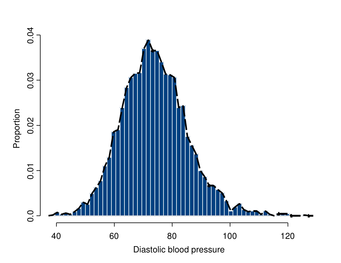
The respondents whose blood pressures are summarized in Figure 6.1 are in reality a sample from a larger population in the sense of Sections 3.2 and 3.3. However, for illustrative purposes we will here pretend that they are actually an entire finite population of 4489 people (the adults in a small town, say). The values summarised in Figure 6.1 then form the population distribution of blood pressure in this population. It is clear that blood pressure is best treated as a continuous variable.
6.2 Population distributions of continuous variables
6.2.1 Population parameters and their point estimates
If we knew all of its values, we could summarise a finite population distribution by, say, a histogram like Figure 6.1. We can also consider specific characteristics of the distribution, i.e. its parameters in the sense introduced in Section 5.3. For the distribution of a continuous variable, the most important parameters are the population mean \[\begin{equation} \mu=\frac{\sum Y_{i}}{N} \tag{6.1} \end{equation}\] and the population variance \[\begin{equation} \sigma^{2} = \frac{\sum (Y_{i}-\mu)^{2}}{N} \tag{6.2} \end{equation}\] or, instead of the variance, the population standard deviation \[\begin{equation} \sigma = \sqrt{\frac{\sum (Y_{i}-\mu)^{2}}{N}}. \tag{6.3} \end{equation}\] Here \(\mu\) and \(\sigma\) are the lower-case Greek letters “mu” and “sigma” respectively, and \(\sigma^{2}\) is read “sigma squared”. It is common to use Greek letters for population parameters, as we did also for the probability parameter \(\pi\) in Chapter 5.
In ((6.1))–((6.3)), \(N\) is the number of units in a finite population and the sums indicated by \(\Sigma\) are over all of these \(N\) units. If we treat the data in Figure 6.1 as a population, \(N=4489\) and these population parameters are \(\mu=74.2\), \(\sigma^{2}=127.87\) and \(\sigma=11.3\).
Because the formulas ((6.1))–((6.3)) involve the population size \(N\), they apply in this exact form only to finite populations like the one in this example (and as discussed more generally in Section 3.2) but not to infinite ones of the kind discussed in Section 3.4. However, the definitions of \(\mu\), \(\sigma^{2}\), \(\sigma\) and other parameters can be extended to apply also to infinite populations. These definitions, which will be omitted here, involve the concept of continuous probability distributions that is discussed in the next section. The interpretations of the population parameters turn out to be intuitively similar for both the finite and infinite-population cases, and the same methods of analysis apply to both, so we can here ignore the distinction without further comment.
The population formulas ((6.1))–((6.3)) clearly resemble those of some sample statistics introduced in Chapter 2, specifically the sample mean, variance and standard deviation \[\begin{equation} \bar{Y}=\frac{\sum Y_{i}}{n}, \tag{6.4} \end{equation}\] \[\begin{equation} s^{2} = \frac{\sum (Y_{i}-\bar{Y})^{2}}{n-1} \tag{6.5} \end{equation}\] and \[\begin{equation} s = \sqrt{\frac{\sum (Y_{i}-\bar{Y})^{2}}{n-1}} \tag{6.6} \end{equation}\]
where the sums are now over the \(n\) observations in a sample. These can be used as descriptions of the sample distribution as discussed in Chapter 2, but also as point estimates of the corresponding population parameters in the sense defined in Section 5.4. We may thus use the sample mean \(\bar{Y}\) as a point estimate of the population mean \(\mu\), and the sample variance \(s^{2}\) and sample standard deviation \(s\) as point estimates of population variance \(\sigma^{2}\) and standard deviation \(\sigma\) respectively. These same estimates can be used for both finite and infinite population distributions.
For further illustration of the connection between population and sample quantities, we have also drawn a simple random sample of \(n=50\) observations from the finite population of \(N=4489\) observations in Figure 6.1. Table 6.1 shows the summary statistics ((6.4)–((6.6)) in this sample and the corresponding parameters ((6.1))–((6.3)) in the population.
|
Size |
Mean |
Standard Deviation |
Variance |
|
|---|---|---|---|---|
| Population | \(N=4489\) | \(\mu=74.2\) | \(\sigma=11.3\) | \(\sigma^{2}=127.87\) |
| Sample | \(n=50\) | \(\bar{Y}=72.6\) | \(s=12.7\) | \(s^{2}=161.19\) |
You may have noticed that the formulas of the sample variance ((6.5)) and sample standard deviation ((6.6)) involve the divisor \(n-1\) rather than the \(n\) which might seem more natural, while the population formulas ((6.2)) and ((6.3)) do use \(N\) rather than \(N-1\). The reason for this is that using \(n-1\) gives the estimators certain mathematically desirable properties (\(s^{2}\) is an unbiased estimate of \(\sigma^{2}\), but \(\hat{\sigma}^{2}\) below is not). This detail need not concern us here. In fact, the statistics which use \(n\) instead, i.e. \[\begin{equation} \hat{\sigma}^{2}=\frac{\sum (Y_{i}-\bar{Y})^{2}}{n} \tag{6.7} \end{equation}\] for \(\sigma^{2}\) and \(\hat{\sigma}=\sqrt{\hat{\sigma}^{2}}\) for \(\sigma\), are also sensible estimates and very similar to \(s^{2}\) and \(s\) unless \(n\) is very small. In general, there are often several possible sample statistics which could be used as estimates for the same population parameter.
6.3 Probability distributions of continuous variables
6.3.1 General comments
Thinking about population distributions of continuous distributions using, say, histograms as in Figure 6.1 would present difficulties for statistical inference, for at least two reasons. First, samples cannot in practice give us enough information to make reliable inferences on all the details of a population distribution, such as the small kinks and bumps of Figure 6.1. Such details would typically not even be particularly interesting compared to major features like the central tendency and variation of the population distribution. Second, this way of thinking about the population distribution is not appropriate when the population is regarded as infinite.
Addressing both of these problems requires one more conceptual leap. This is to make the assumption that the population distribution is well-represented by a continuous probability distribution, and focus on inference on the parameters of that distribution.
We have already introduced the concept of probability distributions in Section 3.5, and considered instances of it in Chapters 4 and 5. There, however, the term was not emphasised because it added no crucial insight into the methods of inference. This was because for discrete variables a probability distribution is specified simply by listing the probabilities of all the categories of the variable. The additional terminology of probability distributions and their parameters seems almost redundant in that context.
The situation is very different for continuous variables. This is illustrated by Figure 6.2, which shows the same frequency polygon as in Figure 6.1, now supplemented by a smooth curve. This curve (“a probability density function”) describes a particular probability distribution. It can be thought of as a smoothed version of the shape of the frequency polygon. What we will do in the future is to use some such probability distribution to represent the population distribution. This means effectively arguing that we believe that the shape of the true population distribution is sufficiently regular to be well described by a smooth curve such as the one in Figure 6.2.
In Figure 6.2 the curve and the frequency polygon have reasonably similar shapes, so the assumption that the former is a good representation of the latter does not seem far-fetched. However, the two are clearly not exactly the same, nor do we expect that even the blood pressures of all English adults exactly match this curve or any other simple probability distribution. All we require is that a population distribution is close enough to a specified probability distribution for the results from analyses based on this assumption to be meaningful and not misleading.

Such a simplifying assumption about the population distribution is known as a statistical model for the population. The reason for working with a model is that it leads to much simpler methods of analysis than would otherwise be required. For example, the shape of the distribution shown in Figure 6.2 is entirely determined by just two parameters, its mean and variance. Under this model, all questions about the population distribution can thus be reduced to questions about these two population parameters, and inference can focus on tests and confidence intervals for them.
The potential cost of choosing a specific probability distribution as the statistical model for a particular application is that the assumption may be inappropriate for the data at hand, and if it is, conclusions about population parameters derived from analyses based on this assumption may be misleading. The distribution should thus be chosen carefully, usually based on both substantive considerations and initial descriptive examination of the observed data.
For example, the particular probability distribution shown in Figure 6.2, which is known as the normal distribution, is by definition symmetric around its mean. While it is an adequate approximation of many approximately symmetric population distributions of continuous variables, such as that of blood pressure, many other population distributions are not even roughly symmetric. It would be unrealistic to assume the population distributions of such variables to be normal. Instead, we might consider other continuous probability distributions which can be skewed. Examples of these are the Exponential, Gamma, Weibull, and Beta distributions. Discrete distributions, of course, will require quite different probability disributions, such as the Binomial distribution discussed in Chapter 5, or the Multinomial and Poisson distributions. On this course, however, we will not include further discussion of these various possibilities.
6.3.2 The normal distribution as a population distribution
The particular probability distribution that is included in Figure 6.2 is a normal distribution, also known as the Gaussian distribution, after the great German mathematician Karl Friedrich Gauss who was one of the first to derive it in 1809. Figure 6.3 shows a portrait of Gauss from the former German 10-DM banknote, together with pictures of the university town of Göttingen and of the normal curve (even the mathematical formula of the curve is engraved on the note). The curve of the normal distribution is also known as the “bell curve” because of its shape.

The normal distribution is by far the most important probability distribution in statistics. The main reason for this is its use as a sampling distribution in a wide range of contexts, for reasons that are explained in Section 6.4. However, the normal distribution is also useful for describing many approximately symmetric population distributions, and it is in this context that we introduce its properties first.
A normal distribution is completely specified by two numbers, its mean (or “expected value”) \(\mu\) and variance \(\sigma^{2}\). This is sometimes expressed in notation as \(Y\sim N(\mu, \sigma^{2})\), which is read as “\(Y\) is normally distributed with mean \(\mu\) and variance \(\sigma^{2}\)”. Different values for \(\mu\) and \(\sigma^{2}\) give different distributions. For example, the curve in Figure 6.2 is that of the \(N(74.2, \, 127.87)\) distribution, where the mean \(\mu=74.2\) and variance \(\sigma^{2}=127.87\) are the same as the mean and variance calculated from formulas ((6.1)) and ((6.2)) for the 4489 observations of blood pressure. This ensures that this particular normal curve best matches the frequency polygon in Figure 6.2.
The mean \(\mu\) describes the central tendency of the distribution, and the variance \(\sigma^{2}\) its variability. This is illustrated by Figure 6.4, which shows the curves for three different normal distributions. The mean of a normal distribution is also equal to both its median and its mode. Thus \(\mu\) is the central value in the sense that it divides the distribution into two equal halves, and it also indicates the peak of the curve (the highest probability, as discussed below). In Figure 6.4, the curves for \(N(0, 1)\) and \(N(0, 9)\) are both centered around \(\mu=0\); the mean of the \(N(5, 1)\) distribution is \(\mu=5\), so the whole curve is shifted to the right and centered around 5.

The variance \(\sigma^{2}\) determines how widely spread the curve is. In Figure 6.4, the curves for \(N(0, 1)\) and \(N(5, 1)\) have the same variance \(\sigma^{2}=1\), so they have the same shape in terms of their spread. The curve for \(N(0, 9)\), on the other hand, is more spread out, because it has a higher variance of \(\sigma^{2}=9\). As before, it is often more convenient to describe variability in terms of the standard deviation \(\sigma\), which is the square root of the variance. Thus we may also say that the \(N(0, 9)\) distribution has the standard deviation \(\sigma=\sqrt{9}=3\) (for \(\sigma^{2}=1\) the two numbers are the same, since \(\sqrt{1}=1\)).
In the histogram in Figure 6.1, the heights of the bars correspond to the proportions of different ranges of blood pressure among the 4489 people in the data set. Another way of stating this is that if we were to sample a person from this group at random, the heights of the bars indicate the probabilities that the selected person’s blood pressure would be in a particular range. Some values are clearly more likely than others. For example, for blood pressures in the range 50–51.5, the probability is about 0.0025, corresponding to a low bar, while for the range 74–75.5 it is about 0.0365, corresponding to a much higher bar.
The interpretation is the same for the curve of a continuous probability distribution. Its height also indicates the probability of different values in random sampling from a population with that distribution. More precisely, the areas under the curve give such probabilities for ranges of values. Probabilities of all the possible values must add up to one, so the area under the whole curve is one — i.e. a randomly sampled unit must have some value of the variable in question. More generally, the area under the curve for a range of values gives the probability that the value of a randomly sampled observation is in that range. These are the same principles that we have already used to derive \(P\)-values for tests in Sections 4.3.5 and 5.5.3.

Figure 6.5 illustrates this further with some results which hold for any normal distribution, whatever its mean and variance. The grey area in the figure corresponds to values from \(\mu-\sigma\) to \(\mu+\sigma\), i.e. those values which are no further than one standard deviation from the mean. The area of the grey region is 0.68, so the probability that a randomly sampled value from a normal distribution is within one standard deviation of the mean is 0.68. The two shaded regions either side of the grey area extend the area to 1.96 standard deviations below and above the mean. The probability of this region (the grey and shaded areas together) is 0.95. Rounding the 1.96 to 2, we can thus say that approximately 95% of observations drawn from a normal distribution tend to be within two standard deviations of the mean. This leaves the remaining 5% in the two tails of the distribution, further than 1.96 standard deviations from the mean (the two white areas in Figure 6.5). Because the normal distribution is symmetric, these two areas are of equal size and each thus has the probability 0.025 (i.e. 0.05/2).
Such calculations can also be used to determine probabilities in particular examples. Returning to the blood pressure data, we might for example be interested in
the proportion of people in some population whose diastolic blood pressure is higher than 90 (one possible cut-off point for high blood pressure or hypertension)
the proportion of people with diastolic blood pressure below 60 (possibly indicating unusually low blood pressure or hypotension)
the proportion of people in the normal pressure range of 60–90
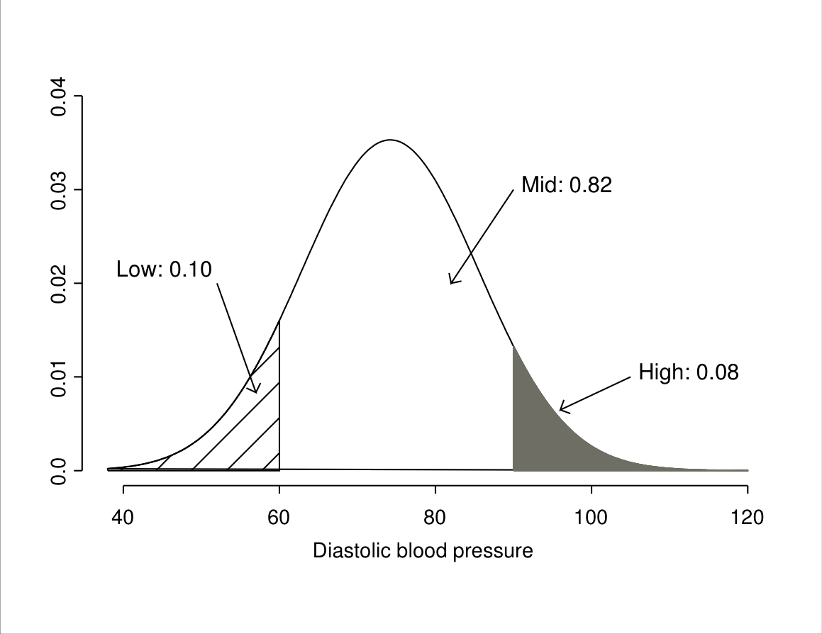
Such figures might be of interest for example for predicting health service needs for treating hypertension. Suppose that we were reasonably confident (perhaps from surveys like the one described above) that the distribution of diastolic blood pressure in the population of interest was approximately normally distributed with mean 74.2 and variance 127.87 (and thus standard deviation 11.3). The probabilities of interest are then the areas of the regions shown in Figure 6.6.
The remaining question is how to calculate such probabilities. The short answer is “with a computer”. However, to explain an approach which is required for this in some computer packages and also to provide an alternative method which does not require a computer, we need to introduce one more new quantity. This is the Z score, which is defined as \[\begin{equation} Z = \frac{Y-\mu}{\sigma} \tag{6.8} \end{equation}\] where \(Y\) can be any value of the variable of interest. For example, in the blood pressure example the \(Z\) scores corresponding to values 60 and 90 are \(Z=(60-74.2)/11.3=-1.26\) and \(Z=(90-74.2)/11.3=1.40\) respectively. The \(Z\) score can be interpreted as the distance of the value \(Y\) from the mean \(\mu\), measured in standard deviations \(\sigma\). Thus the blood pressure 60, with a \(Z\) score of \(-1.26\), is 1.26 standard deviations below (hence the negative sign) the mean, while 90 (with \(Z\) score 1.40) is 1.40 standard deviations above the mean.
The probability distribution of the \(Z\) scores is a normal distribution with mean 0 and variance 1, i.e. \(Z\sim N(0,1)\). This is known as the standard normal distribution. The usefulness of \(Z\) scores lies in the fact that by transforming the original variable \(Y\) from the \(N(\mu, \sigma^{2}\)) distribution into the standard normal distribution they remove the specific values of \(\mu\) and \(\sigma\) from the calculation. With this trick, probabilities for any normal distribution can be calculated using a single table for \(Z\) scores. Such a table is given in the Appendix, and an extract from it is shown in Table 6.2 (note that it is not always presented exactly like this, as different books may use slightly different format or notation). The first column lists values of the \(Z\) score (a full table would typically give all values from 0.00 to about 3.50). The second column, labelled “Tail Prob.”, gives the probability that a \(Z\) score for a normal distribution is larger than the value given by \(z\), i.e. the area of the region to the right of \(z\).
| \(z\) | Tail Prob. |
|---|---|
| … | … |
| 1.24 | 0.1075 |
| 1.25 | 0.1056 |
| 1.26 | 0.1038 |
| 1.27 | 0.1020 |
| … | … |
| 1.38 | 0.0838 |
| 1.39 | 0.0823 |
| 1.40 | 0.0808 |
| 1.41 | 0.0793 |
| … | … |
Consider first the probability that blood pressure is greater than 90, i.e. the area labelled “High” in Figure 6.6. We have seen that 90 corresponds to a \(Z\) score of 1.40, so the probability of high blood pressure is the same as the probability that the normal \(Z\) score is greater than 1.40. The row for \(z=1.40\) in the table tells us that this probability is 0.0808, or 0.08 when rounded to two decimal places as in Figure 6.6.
The second quantity of interest was the probability of a blood pressure at most 60, i.e. the area of the “Low” region in Figure 6.6. The corresponding \(Z\) score is \(-1.26\). The table, however, shows only positive values of \(z\). This is because we can use the symmetry of the normal distribution to reduce all such questions to ones about positive values of \(z\). Because the distribution is symmetric, the probability that a \(Z\) score is at most \(-1.26\) (the area of the left-hand tail to the left of \(-1.26\)) is the same as the probability that it is at least 1.26 (the area of the right-hand tail to the right of 1.26). This is the kind of quantity we calculated above.25 The required probability is thus equal to the right-hand tail probability for 1.26, which the table shows to be 0.1038 (rounded to 0.10 in Figure 6.6).
Finally, the probability of the “Mid” range of blood pressure is the remaining probability not in the two other regions. Because the whole area under the curve (the total probability) is 1, the required probability is obtained by subtraction as \(1-(0.0808+0.1038)=0.8154\). In this example these values obtained from the normal approximation of the population distribution are very accurate. The exact proportions of the 4489 respondents who had diastolic blood pressure at most 60 or greater than 90 were 0.0996 and 0.0793 respectively, so rounded to two decimal places they were the same as the 0.10 and 0.08 obtained from the normal approximation.
These days we can use statistical computer programs to
calculate such probabilities directly for a normal distribution with any
mean and standard deviation. For example, SPSS has a function called
CDF.NORMAL(quant,mean,stddev) for this purpose. It calculates the
probability that the value from a normal distribution with mean mean
and standard deviation stddev is at most quant.
In practice we do not usually know the population mean and variance, so their sample estimates will be used in such calculations. For example, for the sample in Table 6.1 we had \(\bar{Y}=72.6\) and \(s=12.7\). Using these values in a similar calculation as above gives the estimated proportion of people in the population with diastolic blood pressures over 90 as 8.5%. Even with a sample of only 50 observations, the estimate is reasonably close to the true population proportion of about 8.1%.
6.4 The normal distribution as a sampling distribution
We have already encountered the normal distribution in Section 5.5.3, in the role of the sampling distribution of a test statistic rather than as a model for the population distribution of a variable. In fact, the most important use of the normal distribution is as a sampling distribution, because in this role it often cannot be replaced by any other simple distributions. The reasons for this claim are explained in this section. We begin with the case of the distribution of the sample mean in samples from a normal population, before extending it with a result which provides the justification for the standard normal sampling distributions used for inference on proportions in Chapter 5, and even for the \(\chi^{2}\) sampling distribution of the \(\chi^{2}\) test in Chapter 4.
Recall from Section 4.3.4 that the sampling distribution of a statistic is its distribution across all possible random samples of a given size from a population. The statistic we focus on here is the sample mean \(\bar{Y}\). If we assume that the population distribution is exactly normal, we have the following result:
- If the population distribution of a variable \(Y\) is normal with mean \(\mu\) and variance \(\sigma^{2}\), the sampling distribution of the sample mean \(\bar{Y}\) for a random sample of size \(n\) is also a normal distribution, with mean \(\mu\) and variance \(\sigma^{2}/n\).
The mean and variance of this sampling distribution are worth discussing separately:
The mean of the sampling distribution of \(\bar{Y}\) is equal to the population mean \(\mu\) of \(Y\). This means that while \(\bar{Y}\) from a single sample may be below or above the true \(\mu\), in repeated samples it would on average estimate the correct parameter. In statistical language, \(\bar{Y}\) is then an unbiased estimate of \(\mu\). More generally, most possible samples would give values of \(\bar{Y}\) not very far from \(\mu\), where the scale for “far” is provided by the standard deviation discussed below.
The variance of the sampling distribution of \(\bar{Y}\) is \(\sigma^{2}/n\) or, equivalently, its standard deviation is \(\sigma/\sqrt{n}\). This standard deviation is also known as the standard error of the mean, and is often denoted by something like \(\sigma_{\bar{Y}}\). It describes the variability of the sampling distribution. Its magnitude depends on \(\sigma\), i.e. on the variability of \(Y\) in the population. More interestingly, it also depends on the sample size \(n\), which appears in the denominator in \(\sigma/\sqrt{n}\). This means that the standard error of the mean is smaller for large samples than for small ones. This is illustrated in Figure 6.7. It shows the sampling distribution of \(\bar{Y}\) for samples of sizes \(n=50\) and \(n=1000\) from a normal population with \(\mu=74.2\) and \(\sigma=11.3\), i.e. the population mean and standard deviation in the blood pressure example. It can be seen that while both sampling distributions are centered around the true mean \(\mu=74.2\), the distribution for the smaller sample is more spread out than that for the larger sample: more precisely, the standard error of the mean is \(\sigma/\sqrt{n}=11.3/\sqrt{50}=1.60\) when \(n=50\) and \(11.3/\sqrt{1000}=0.36\) when \(n=1000\). Recalling from Section 6.3.2 that approximately 95% of the probability in a normal distribution is within two standard deviations of the mean, this means that about 95% of samples of size 50 in this case would give a value of \(\bar{Y}\) between \(\mu-2*1.60=74.2-3.2=71.0\) and \(74.2+3.2=77.4\). For samples of size \(n=1000\), on the other hand, 95% of samples would yield \(\bar{Y}\) in the much narrower range of \(74.2-2*0.36=73.5\) to \(74.2+2*0.36=74.9\).

The connection between sample size and the variability of a sampling distribution applies not only to the sample mean but to (almost) all estimates of population parameters. In general, (i) the task of statistical inference is to use information in a sample to draw conclusions about population parameters; (ii) the expected magnitude of the sampling error, i.e. the remaining uncertainty about population parameters resulting from having information only on a sample, is characterised by the variability of the sampling distributions of estimates of the parameters; and (iii) other things being equal, the variability of a sampling distribution decreases when the sample size increases. Thus data really are the currency of statistics and more data are better than less data. In practice data collection of course costs time and money, so we cannot always obtain samples which are as large as we might otherwise want. Apart from resource constraints, the choice of sample size depends also on such things as the aims of the analysis, the level of precision required, and guesses about the variability of variables in the population. Statistical considerations of the trade-offs between them in order to make decisions about sample sizes are known as power calculations. They will be discussed very briefly later, in Section 7.6.2.
In Figure 6.8 we use a computer simulation rather than a mathematical theorem to examine the sampling distribution of a sample mean. Here 100,000 simple random samples of size \(n=50\) were drawn from the \(N=4489\) values of blood pressure that we are treating as the finite population in this illustration. The sample mean \(\bar{Y}\) of blood pressure was calculated for each of these samples, and the histogram of these 100,000 values of \(\bar{Y}\) is shown in Figure 6.8. Also shown is the curve of the normal distribution with the mean \(\mu\) and standard deviation \(\sigma/\sqrt{50}\) determined by the theoretical result given above.
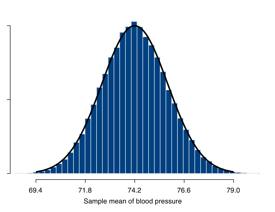
The match between the curve and the histogram in Figure 6.8 is clearly very close. This is actually a nontrivial finding which illustrates a result which is of crucial importance for statistical inference. Recall that the normal curve shown in Figure 6.8 is derived from the mathematical result stated above, which assumed that the population distribution of \(Y\) is exactly normal. The histogram in Figure 6.8, on the other hand, is based on repeated samples from the actual population distribution of blood pressure, which, while quite close to a normal distribution as shown in Figure 6.2, is certainly not exactly normal. Despite this, it is clear that the normal curve describes the histogram essentially exactly.
If this was not true, that is if the sampling distribution that applies for the normal distribution was inadequate when the the true population distribution was even slightly different from normal, the result would be of little practical use. No population distribution is ever exactly normal, and many are very far from normality. Fortunately, however, it turns out that quite the opposite is true, and that the sampling distribution of the mean is approximately the same for nearly all population distributions. This is the conclusion from the Central Limit Theorem (CLT), one of the most remarkable results in all of mathematics. Establishing the CLT with increasing levels of generality has been the work of many mathematicians over several centuries, as different versions of it have been proved by, among others, de Moivre, Laplace, Cauchy, Chebyshev, Markov, Liapounov, Lindeberg, Feller, Lévy, Hoeffding, Robbins, and Rebolledo between about 1730 and 1980. One version of the CLT can be stated as
The (Lindeberg-Feller) Central Limit Theorem: For each \(n=1,2,\dots\), let \(Y_{nj}\), for \(j=1,2,\dots,n\), be independent random variables with \(\text{E}(Y_{nj})=0\) and \(\text{var}(Y_{nj})=\sigma^{2}_{nj}\). Let \(Z_{n}=\sum_{j=1}^{n} Y_{nj}\), and let \(B^{2}_{n}=\text{var}(Z_{n})=\sum_{j=1}^{n} \sigma^{2}_{nj}\). Suppose also that the following condition holds: for every \(\epsilon>0\), \[\begin{equation} \frac{1}{B_{n}^{2}}\,\sum_{j=1}^{n} \, \text{E}\{ Y_{nj}^{2} I(|Y_{nj}|\ge \epsilon B_{n})\}\rightarrow 0 \; \text{ as } \; n\rightarrow \infty. \tag{6.9} \end{equation}\] Then \(Z_{n}/B_{n} \stackrel{\mathcal{L}}{\longrightarrow} N(0,1)\).
No, that will not come up in the examination. The theorem is given here just as a glimpse of how this topic would be introduced in a very different kind of text book,26 and because it pleases the author of this coursepack to note that Jarl Lindeberg was Finnish. For our purposes, it is better to state the same result in English:
- If \(Y_{1}, Y_{2}, \dots, Y_{n}\) are a random sample of observations from (almost)27 any distribution with a population mean \(\mu\) and variance \(\sigma^{2}\), and if \(n\) is reasonably large, the sampling distribution of their sample mean \(\bar{Y}\) is approximately a normal distribution with mean \(\mu\) and variance \(\sigma^{2}/n\).
Thus the sampling distribution of the mean from practically any population distribution is approximately the same as when the population distribution is normal, as long as the sample size is “reasonably large”. The larger the sample size is, the closer the sampling distribution is to the normal distribution, and it becomes exactly normal when the sample size is infinitely large (i.e. “asymptotically”). What is large enough depends particularly on the nature of the population distribution. For continuous variables, the CLT approximation is typically adequate even for sample sizes as small as \(n=30\), so we can make use of the approximate normal sampling distribution when \(n\) is 30 or larger. This is, of course, simply a pragmatic rule of thumb which does not mean that the normal approximation is completely appropriate for \(n=30\) but entirely inappropriate for \(n=29\); rather, the approximation becomes better and better as the sample size increases, while below about 30 the chance of incorrect conclusions from using it becomes large enough for us not to usually want to take that risk.
We have seen in Figure 6.7 that in the blood pressure example the sampling distribution given by the Central Limit Theorem is essentially exact for samples of size \(n=50\). In this case this is hardly surprising, as the population distribution itself is already quite close to a normal distribution. The theorem is not, however, limited to such easy cases but works quite generally. To demonstrate this with a more severe test, let us consider a population distribution that is as far as possible from normal. This is the binomial distribution of a binary variable that was introduced in Section 5.3. If the probability parameter of this distribution is \(\pi\), its mean and variance are \(\mu=\pi\) and \(\sigma^{2}=\pi(1-\pi)\), and the sample mean \(\bar{Y}\) of observations from the distribution is the sample proportion \(\hat{\pi}\) (see the equation at the end of Section 5.4). The CLT then tells us that
- When \(n\) is large enough, the sampling distribution of the sample proportion \(\hat{\pi}\) of a dichotomous variable \(Y\) with population proportion \(\pi\) is approximately a normal distribution with mean \(\pi\) and variance \(\pi(1-\pi)/n\).
This powerful result is illustrated in Figure 6.9. It is similar to Figure 6.8 in that it shows sampling distributions obtained from a computer simulation, together with the normal curve suggested by the CLT. For each plot, 5000 samples of size \(n\) were simulated from a population where \(\pi\) was 0.2. The sample proportion \(\hat{\pi}\) was then calculated for each simulated sample, and the histogram of these 5000 values drawn. Four different sample sizes were used: \(n=10\), 30, 100, and 1000. It can be seen that the normal distribution is not a very good approximation of the sampling distribution of \(\hat{\pi}\) when \(n\) is as small as 10 or even 30. For the larger values of 100 and 1000, however, the normal approximation is already quite good, as expected from the CLT.
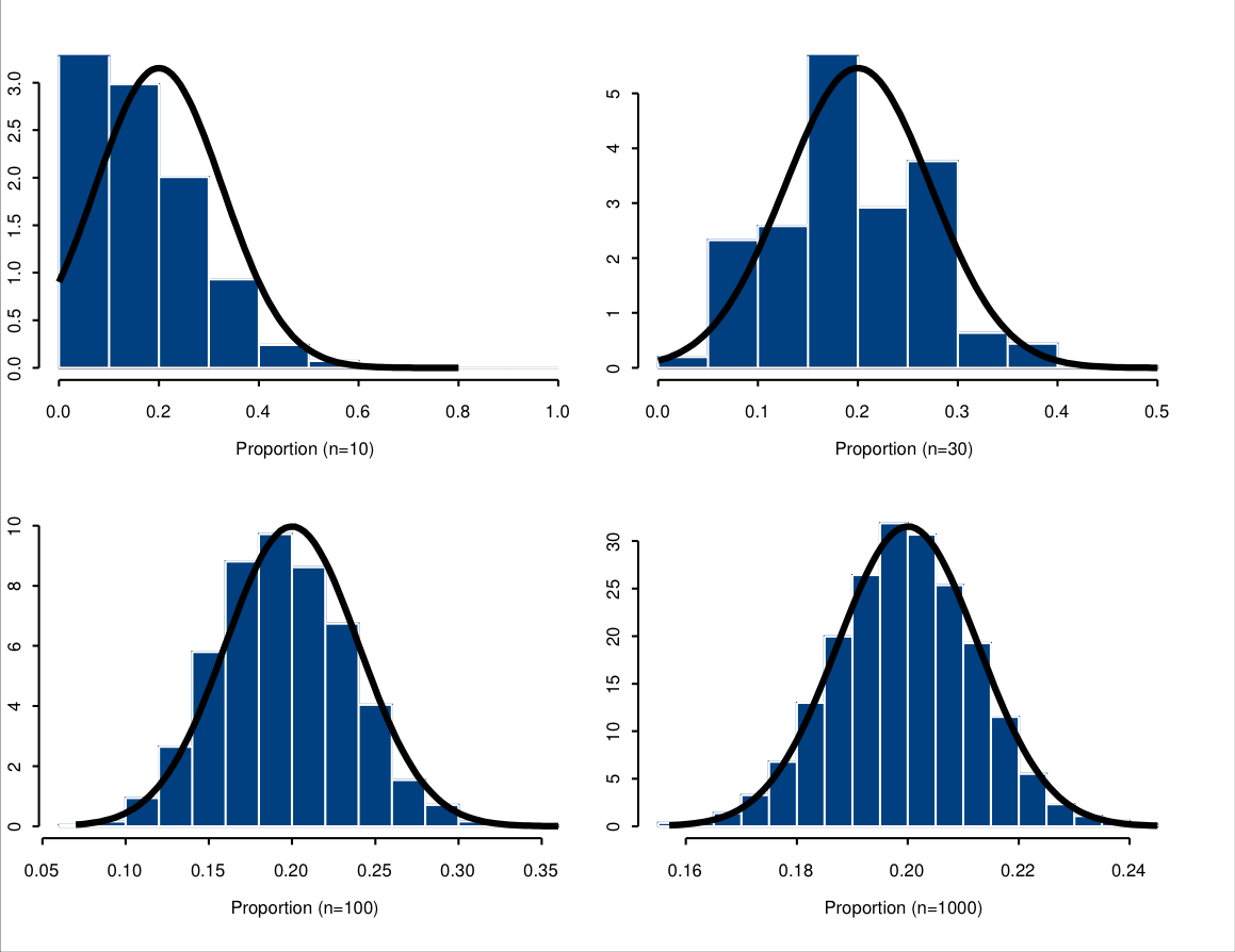
The variability of the sampling distribution will again depend on \(n\). In Figure 6.9, the observed range of values of \(\hat{\pi}\) decreases substantially as \(n\) increases. When \(n=10\), values of between about 0 and 0.4 are quite common, whereas with \(n=1000\), essentially all of the samples give \(\hat{\pi}\) between about 0.16 and 0.24, and a large majority are between 0.18 and 0.22. Thus increasing the sample size will again increase the precision with which we can estimate \(\pi\), and decrease the uncertainty in inference about its true value.
The Central Limit Theorem is, with some additional results, the justification for the standard normal sampling distribution used for tests and confidence intervals for proportions in Chapter 5. The conditions for sample sizes mentioned there (at the beginning of Section 5.5.3 and 5.7) again derive from conditions for the CLT to be adequate. The same is also ultimately true for the \(\chi^{2}\) distribution and conditions for the \(\chi^{2}\) test in Chapter 4. Results like these, and many others, explain the central importance of the CLT in statistical methodology.